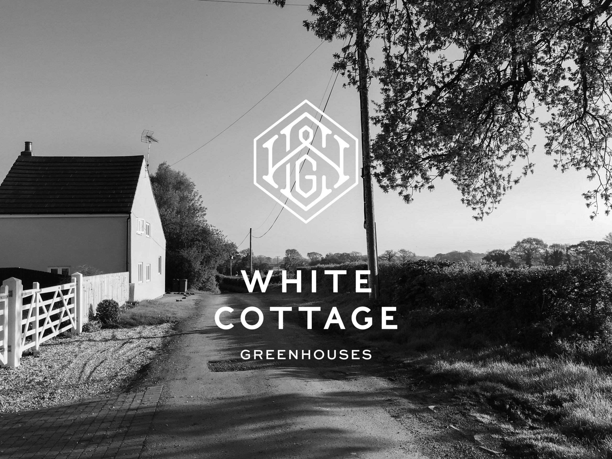
A new look to stand the test of time
Where it all began…
When our parents bought White Cottage – our family home for over 40 years – they had a vision. A new look and life for a house sadly lacking in curb appeal. An ill-considered blend of salt workers’ cottage, dating back to the 1860’s, and an ugly extension added in the 1970’s. The flat roofed dormer being added by the then owner whilst drunk, according to our new neighbours who had witnessed this. The whole thing crusted in a rapidly greying render which seemed to mock both the name and the new inhabitants. As a child, from across the field, I thought it looked like a wedge of blue cheese.
And yet…
White Cottage became the name, and you might now say the brand, that our father created. Why did he choose this name? This reference to a particular colour of home that we did not have? We’ve tried to unravel this recently. Indeed, we toyed with the idea of changing the name altogether. Never mind a new look, a completely new identity was discussed! White Cottage Green Houses. Two colours, two words to describe a home. Did we like this? Was it cute? A contradiction? Or just an odd bounce of words?
It was our family home for a long time. We grew up there. Learnt to read, tell the time, ride bikes, draw in perspective, swim, climb trees. The garden was large. It was surrounded by open countryside, and we could explore and build dens until the cows came home – which they did every day, neighbouring a dairy farm as we were.
For many years…
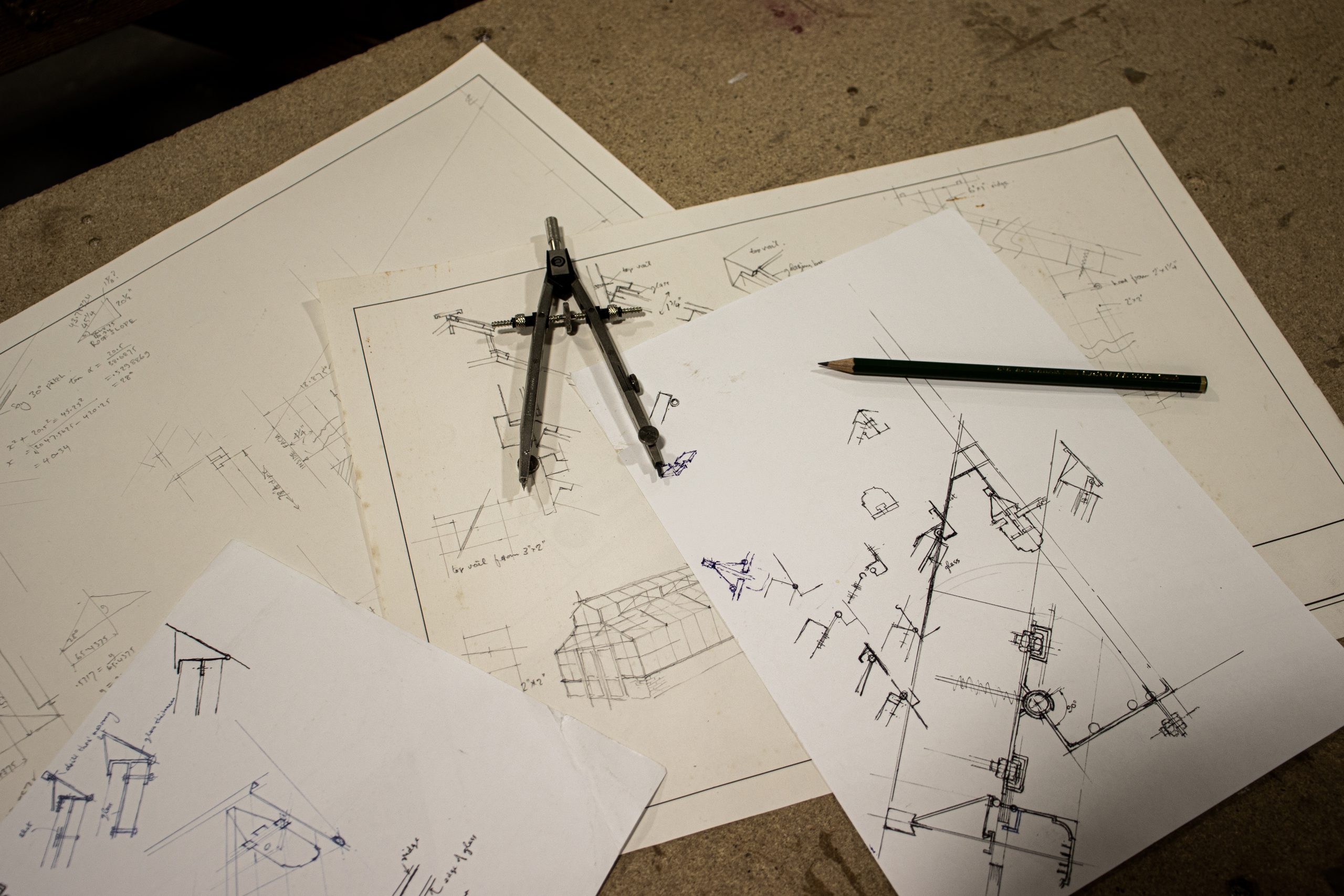
The house was in some state of disrepair or dismantle. Dad’s sketches and calculations filled notebooks and adorned envelopes and scraps of paper. He planned various extensions and modifications. A new look for this room, a new purpose for that space. The writing was on the wall for the flat-roofed dormer long, long before it was eventually removed. But we always remained at the planning stage for far too long. Actual progress was extremely slow and a source of constant frustration to our mother who was continually forced to overcome the frustrating quirks of the place.
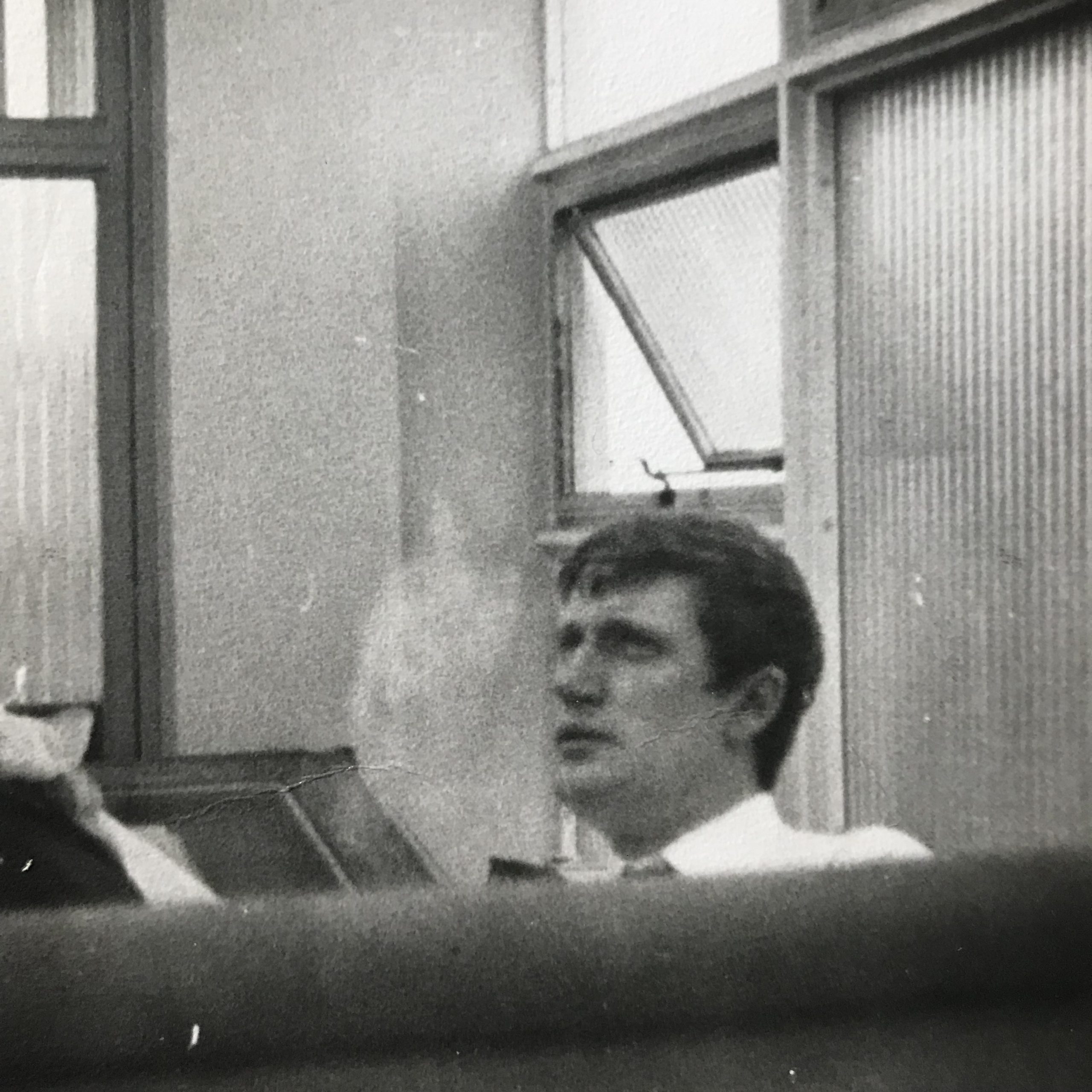
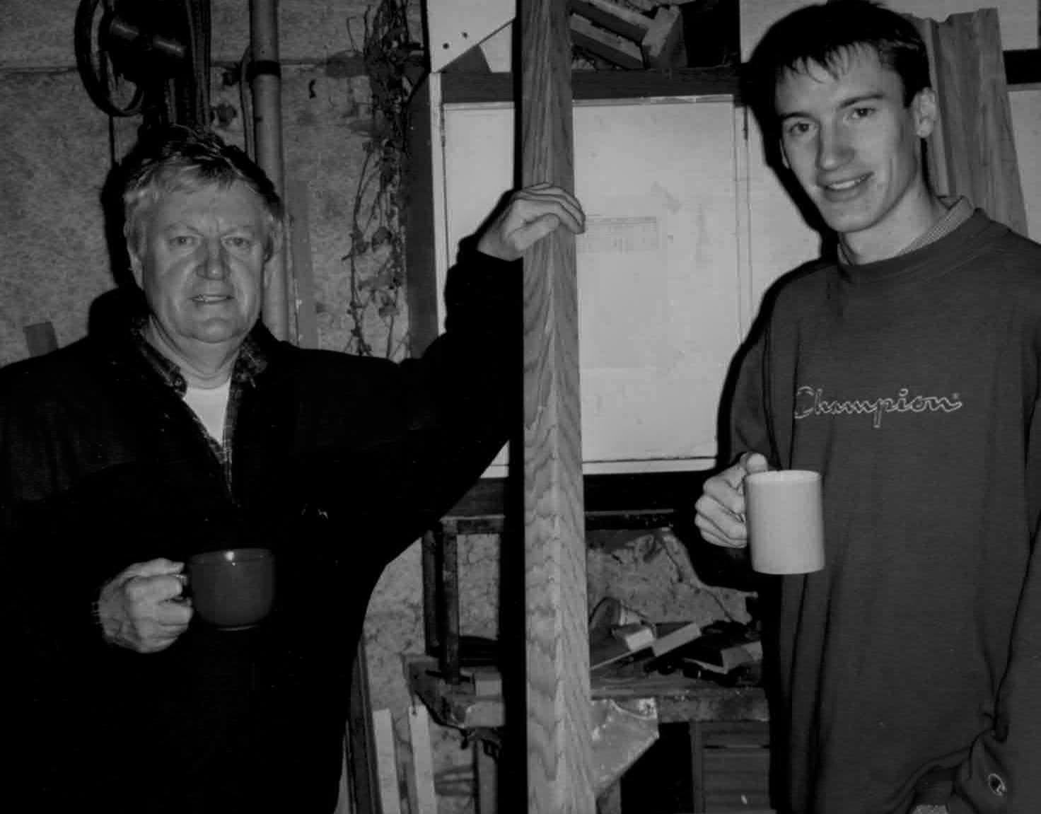
As an engineer…
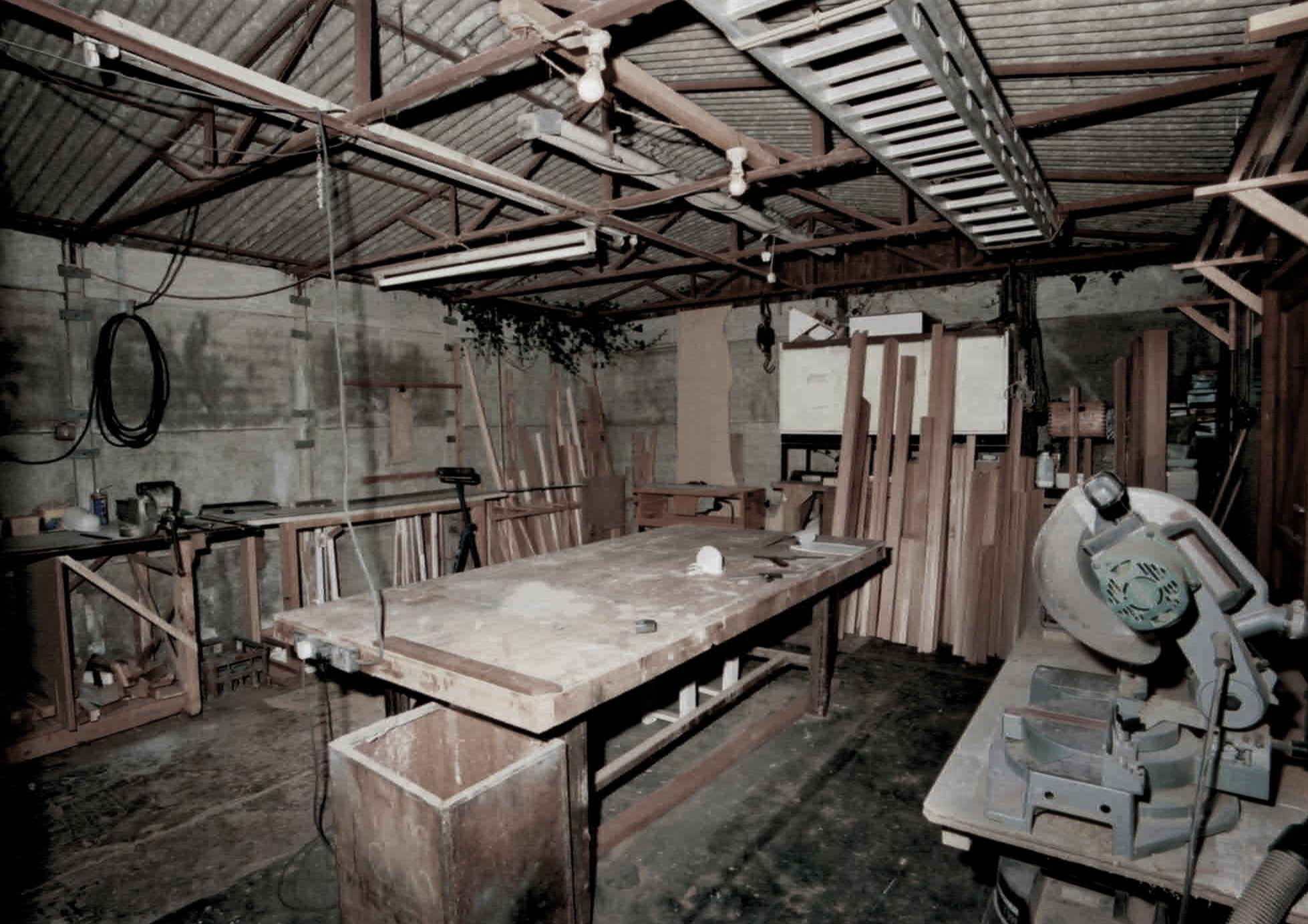
Dad had the capacity to create, but he also had the skills to deliver. A talented artist and draughtsman who could also turn his hand to joinery, bricklaying, plumbing and electrical work. He could do it all and intended to. Bringing in tradespeople was not an option. They might not meet his own high standards, and as such, work on the house often had to take a back seat as work that paid the bills took priority.
We never discussed the use of the house name for the business with Dad, but knowing him as we did, convenience and the lack of something immediately obvious or better will have been driving forces. It was only really needed on the bank account and letter head paper anyway. And having the business address as White Cottage, White Cottage, Grange Lane would no doubt have amused him and felt like a reasonable efficiency.
If he’d been thinking strategically about it, he would have chosen something that began with A, or a number, to ensure he came at the top of the listing in the Yellow Pages – the only form of advertising he undertook in those days. But he wasn’t thinking strategically and whilst brands did exist, not everything was a brand. Not everything needed to think strategically, create holistically and promise an experience, like it does now.
So how did the logo come to be…
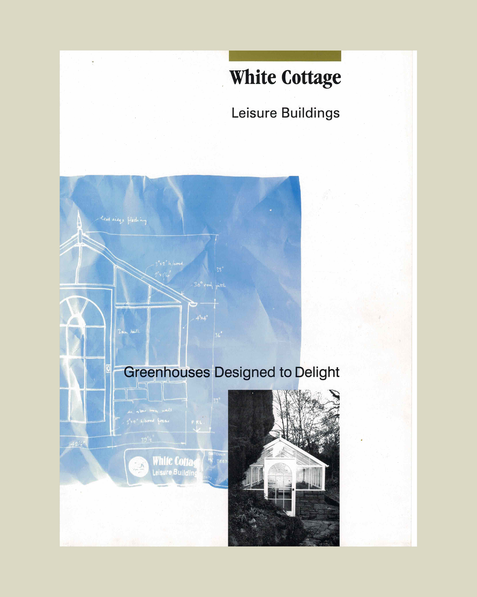
Again, it was derived out of necessity – the company name had to appear at the top of a letter headed paper, and it needed to look a bit more special than just writing it in New Times Roman. But not much. There was no need to over egg this omelette. Some Letraset found in a drawer left over from Dad’s draughtsman days would do. What is that font? Bernard MT Condensed actually… According to Microsoft Typography:
“Bernard MT Condensed maintains a pleasant period charm due to its balanced chunky serifs and rounded strokes. Use it in situations where you want to get attention while maintaining a casual tone.”
Were these the reasons that Dad chose it? They seem sound. He was, after all, all about maintaining attention with a casual tone. He may have known this. That this is what this font is for. It’s the sort of thing he did know. But if the Letraset he found in the drawer had been another one, I’m pretty sure he’d have just as happily used that and we’d have had a slightly different logo.
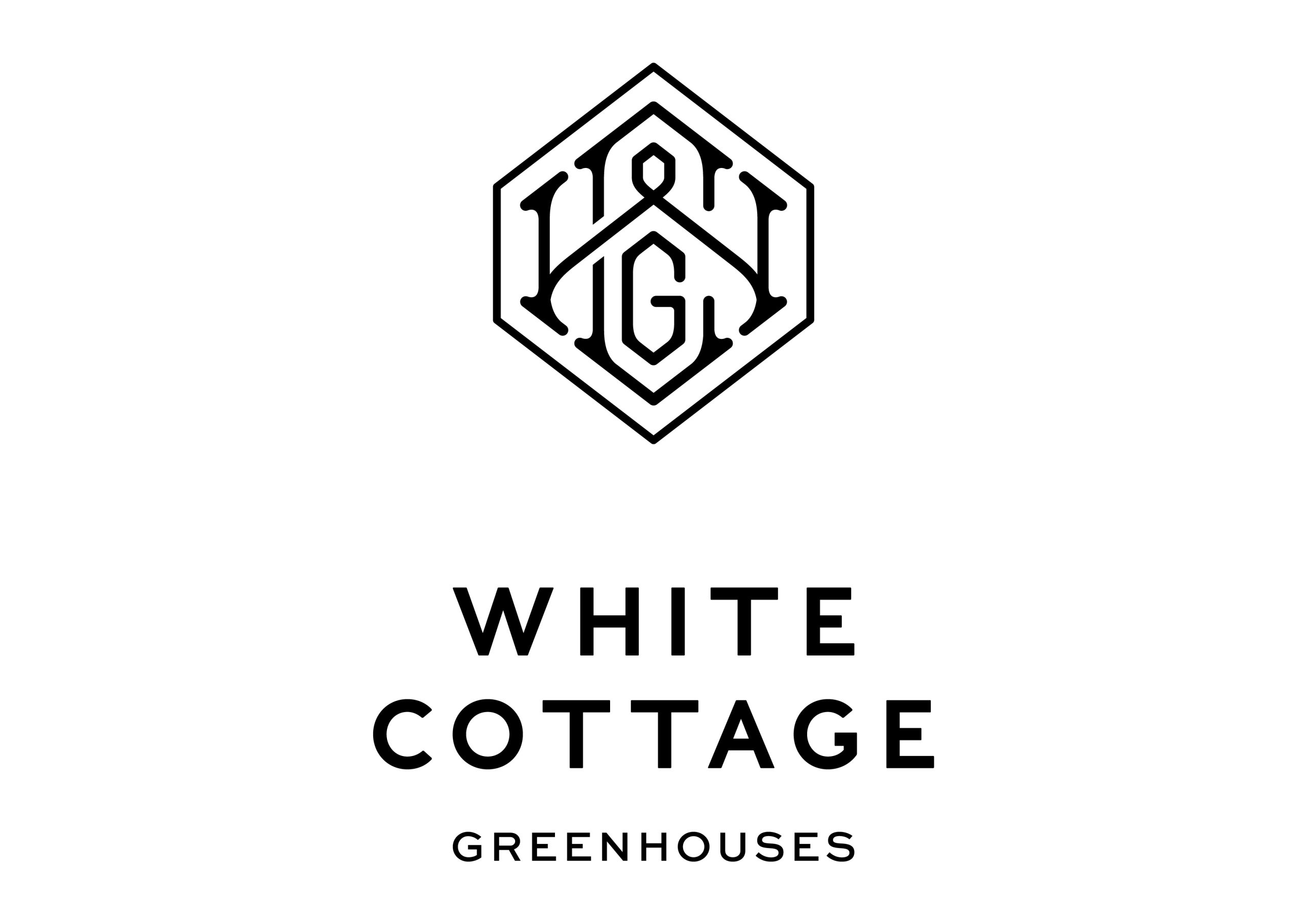
And the marque itself?
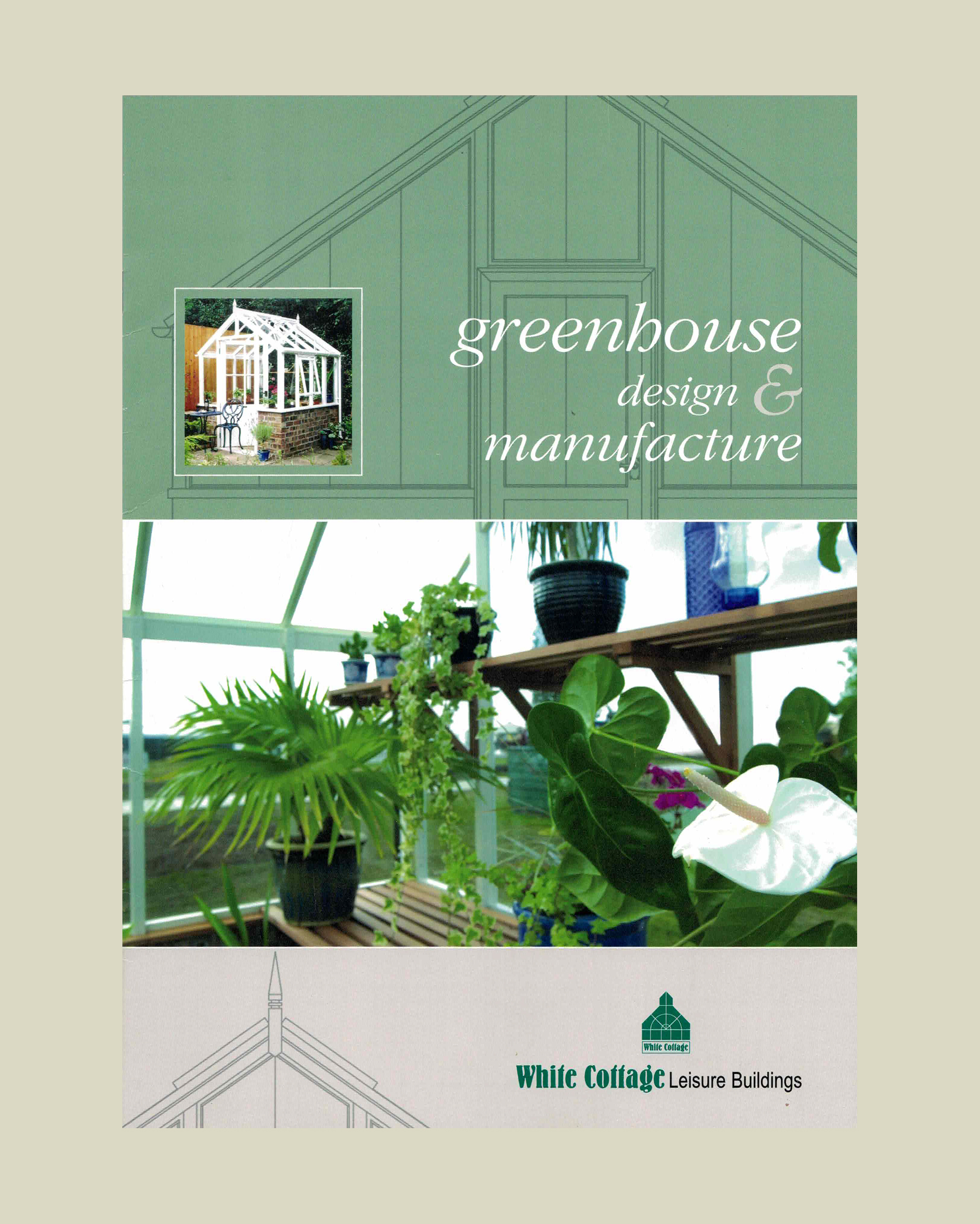
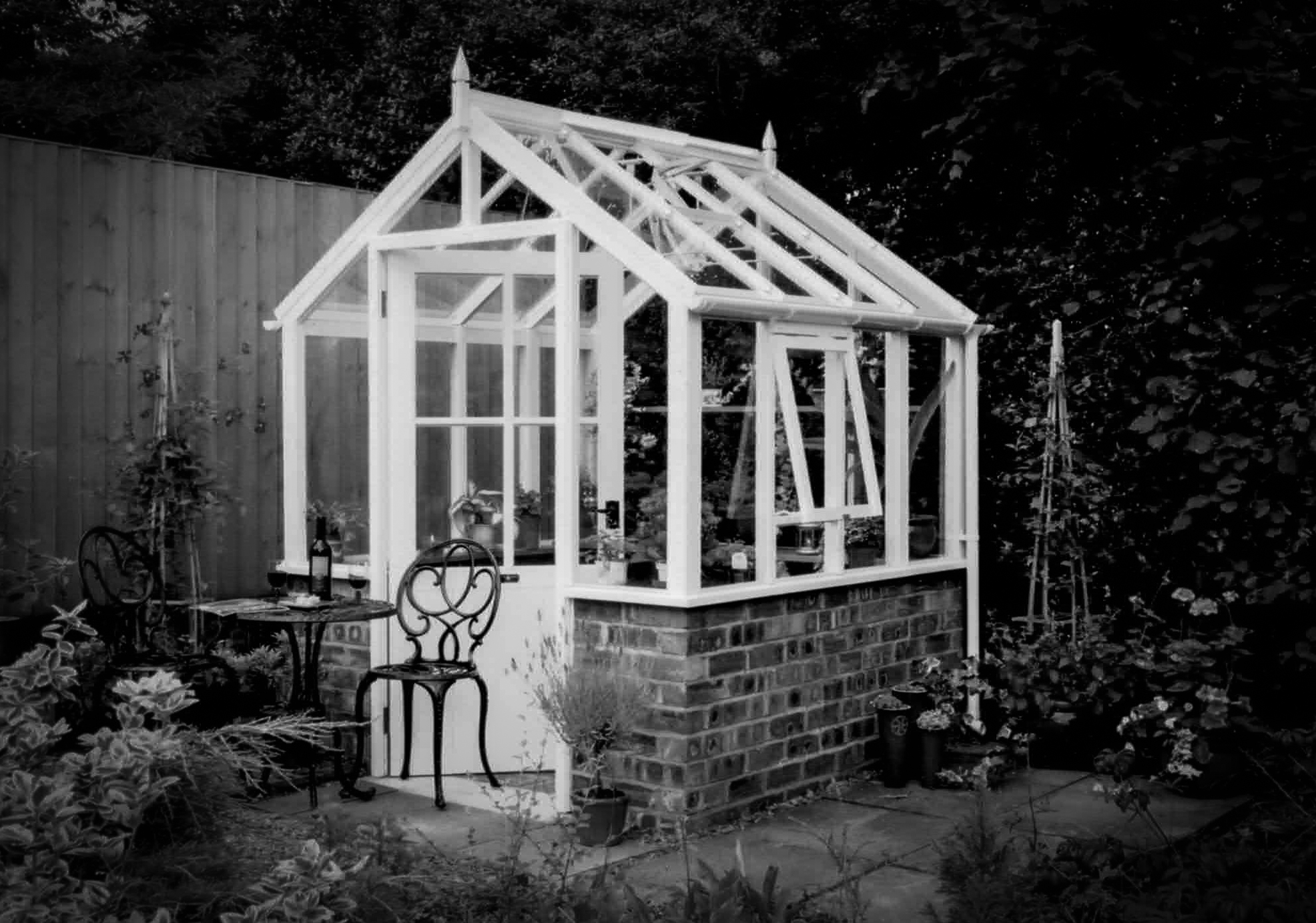
A nod to a lantern roof design element that did indeed feature in some of Dad’s earliest greenhouses. The precursors to the buildings we make now. The first seeds that began to germinate in Dad’s mind about what a proper greenhouse should be like. Back in the days when, dare I say it? He was using polycarbonate in the roofs! Yes, that happened! But I do clearly remember that being one of the very first criteria that Dad identified – all glazing had to be glass.
And it was the 80’s…
We had a lot of woodchip wallpaper at that time too. It wasn’t anyone’s fault. That was how things were done in those days, but it raises an important point – it was these “fads”, these fashions of the times, that Dad was seeking to transgress. His memories of his grandfather’s greenhouse were that it was a perfect structure in every way, and it would work and look just as good now as it did then. This became his mission – to create something timeless that would be loved by the next generation as much as the current or the previous.


Avocado green…
I remember the discussion our parents had about the colour of a new bathroom suite Dad planned to install. Mum was a big fan of green and was very excited about the emergence of the avocado bathroom suite onto the market. Way before eating them became cool, we were going to bathe in it. Dad said she would regret this choice in time, and white was a better option. But white didn’t stand a chance against avocado green with my mother at the creative helm, and said suite, complete with a bidet was duly fitted. At first it was cool. But it did eventually lose it appeal and was subsequently replaced with… a white suite of course.
So, back to the mark…
And this lantern roof reference. It’s one of the major reasons we felt we had to change the company identity. We don’t make greenhouses like that anymore. We haven’t for a very long time. It’s specifically misrepresenting us, which started to bother us. For years, first Dad and then John have been tirelessly refining and improving what we do and how we do it. It’s important that our brand ID reflects this, pays tribute to this effort, acknowledges the endeavour. It is also now important that we consider our business philosophy, our character and personality, as part of our brand. That how we do things is as important as what we do. Our values are represented by our brand image and delivered by our products and service.
The process…
That’s our reasoning for embarking on this rebrand. A marketing term that would have made Dad squirm. Indeed, we are not big fans of this term either, but soon it won’t be a rebrand. It will just be our brand. The one Dad created and that we continue.
As mentioned, we did explore the idea of changing the name altogether, and whilst we are continually meeting people who say they’ve never heard of us, never seen us anywhere before etc, we have concluded that the last 30 plus years does stand for something and distancing ourselves from our own history was not the right move. So, the name stays, but we sold the house and began a process to reimagine our visual identity.
We chose a Cheshire based brand agency to help us with this. Outpost claim to “take brands further through carefully crafted emotional experiences” and work with major brands globally. You can learn more about what they mean by this claim here. With them we did a forensic examination of where we are, where we’ve come from and where we want to end up. What makes our greenhouses unique and special? How does our service and the experience you have when you work with us differ from our competitors? What do we want people to feel when they compare us to the rest of the market?
Here’s a few captions that emerged:
“A company that offers a more personalised service and is a genuine family business”
“Modern, sustainable practice with a reputation for outstanding quality and service and strong design credentials”
“Convey confidence that our products offer value for money, a quality level and the attention to detail discerning clients are looking for”
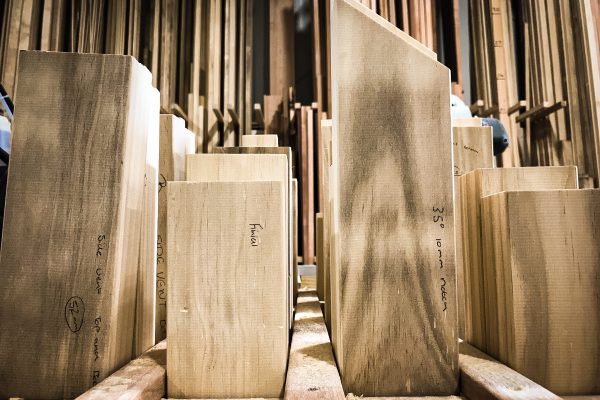
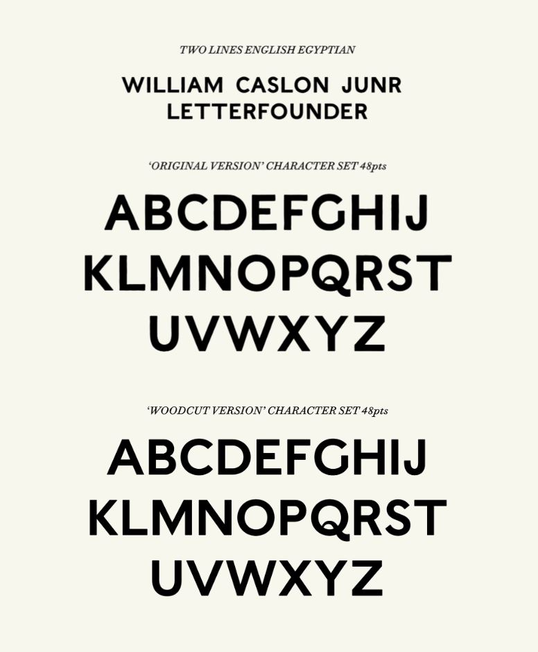
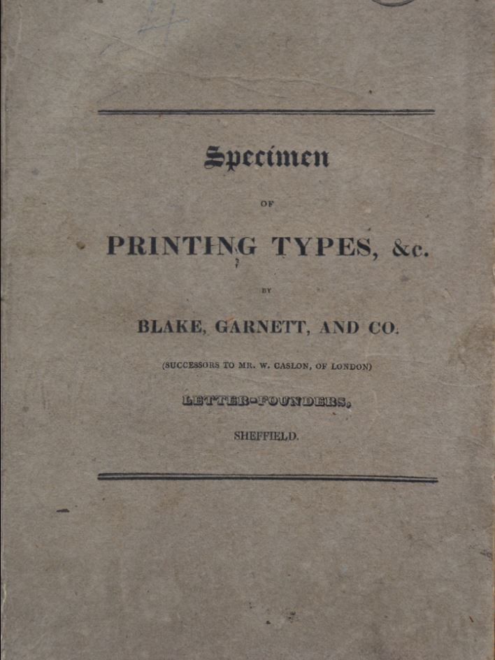
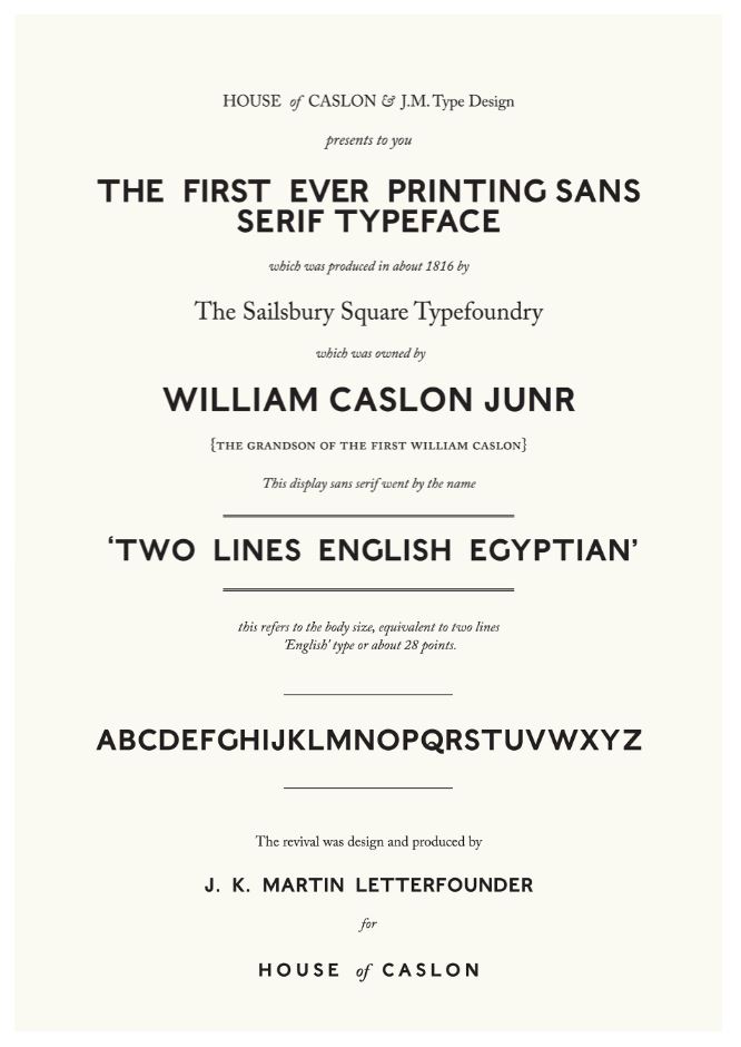
With these amongst other key points paramount, we worked with the design agency to explore what all this actually looks like. For example, the font is based on Caslon’s Two Lines English Egyptian. This font is widely accepted as the first general purpose sans serif typeface and only available in block capitals. This sans serif style was popularised by the architect John Soan and was popular with signwriters. Eventually, this exact font disappeared but there have been many similar fonts designed since that owe their origins to this one. We think this simple statement font shares much with our own design ethos.
The result…
The new marque is clearly our initials – not something we’ll move on from or cease to feel associated with over time. The layout and geometry a subtle nod to the geometry we deploy every day in our design work. The slightly rounded corners pay homage to the slightly rounded corners of our joinery – a small but important detail which adds to the longevity of the paint which coats our frames. A marque which is imbued with what we do and how we do it, and one which we hope will stand the test of time.
And if Dad was still here, we’re sure he would agree.
We also worked with a design agency based in Chester to help us bring this website and our new brochure to life. Stride tell their side of that story here.