A Painted Greenhouse – and the possibilities with colour
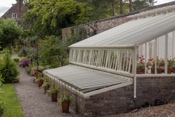
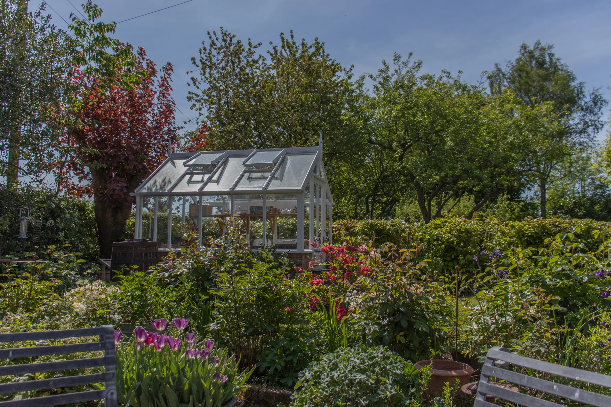
What could be more charming? A painted wooden greenhouse is the perfect focal point for the aspiring cottage gardener, borders overflowing with foxgloves, geranium and erigeron, the greenhouse peeking through the floral profusion, shelves neatly stacked with terracotta pots. And the essential ultimate tool in the productive kitchen gardener’s arsenal, perhaps a lean-to making use of a high wall against which fruits ripen, the epicentre of propagation from early spring, extending the season long into autumn. If only we could convey the scent…
It may also conjure up some trepidation where maintaining this vision of pastoral heaven is concerned. Hours of gardening time used up scraping, sanding and laboriously repainting awkward glazing bars. Dicing with injury should you overstretch on your precarious ladder! Is it worth it? Perhaps they were right; an aluminium greenhouse is the sensible choice…
Allow us to interrupt your reverie/panic with some myth busting. We have good news for your maintenance fears!
And as the experts in painted greenhouses, we have a few things to say about colour too. Let us share some of our extensive experience of what works and what doesn’t and, maybe, inspire you to consider using colour on your greenhouse in different ways, in both heritage and contemporary settings.
But first, let’s take a look back at the origins of the painted greenhouse and consider the trends, past, present and future, and whether we should follow them or not.
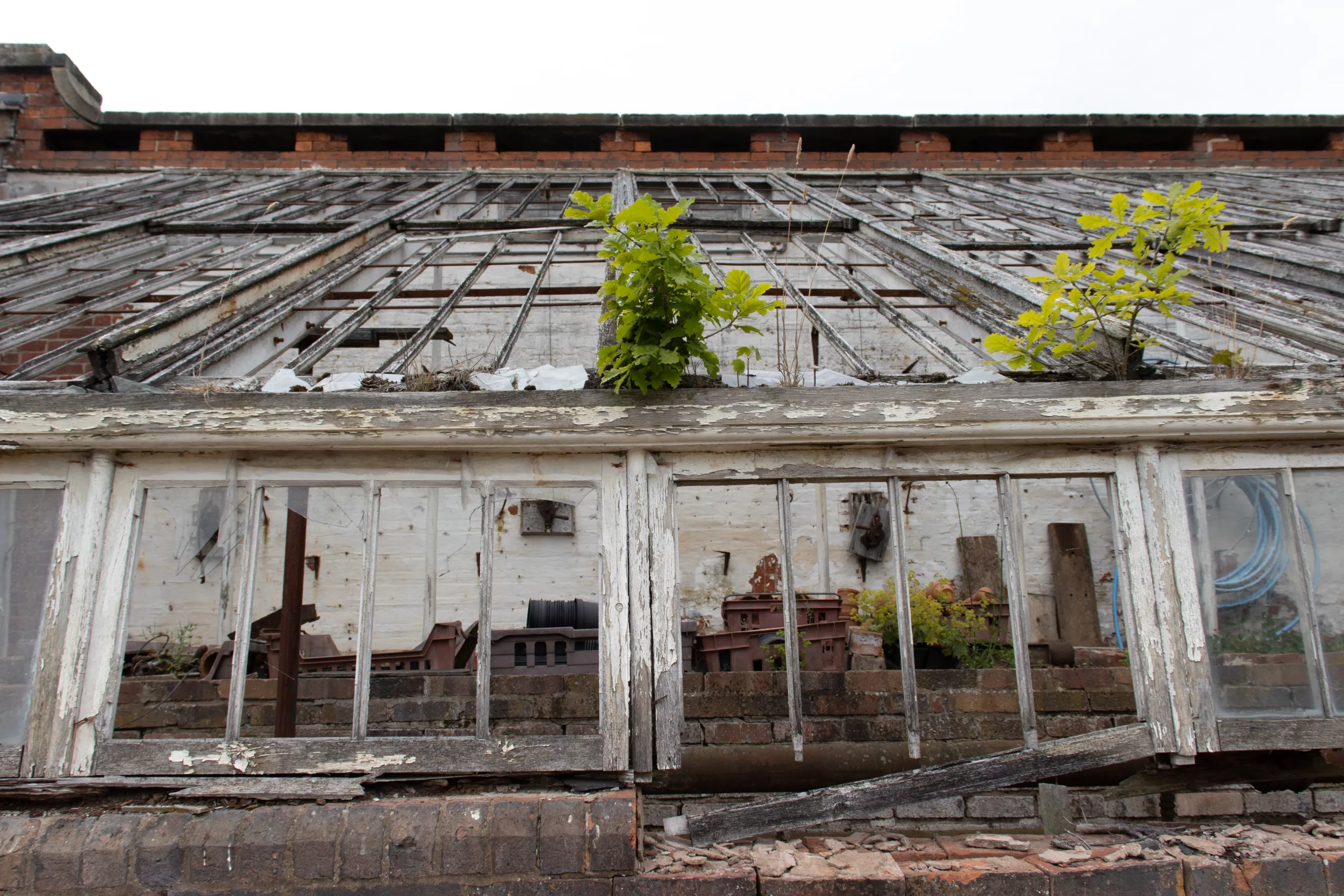
Above, evidence of the once-white paintwork on the remnants of a large lean-to greenhouse in a walled garden in Shropshire dating back to the mid 19th century
What the Victorians did:
Nearly all the original Victorian and Edwardian greenhouses we’ve encountered over the years, or what’s been left of them, show signs of them having been painted. The paint may have pretty much disappeared, flaking and peeling to a dust over the years, revealing the hotchpotch of timbers used to make the framework that, in those days would have included now protected tropical hardwoods. Paint often sticks to the ironwork and there it’s possible to peel back the layers and see what colours were used originally.
As evidenced in photographs taken at the time, white was by far the most common choice for the framework of the glasshouse as well as whitewashing any internal walls, reflecting and intensifying sunlight and providing a blank canvas against which the newly discovered exotics could be shown off most impressively.
Structural ironwork, decorative spandrel brackets and functional vent opening gear might be painted in a contrasting colour – we’ve found them ranging from deep forest or vivid grass greens through to subtler pastel sage shades and sometimes earthy terracotta reds.
Victorian paint was lead-based; as we now know, a highly toxic ingredient that has been eliminated alongside a raft of other unpleasant chemicals in the paints we use today. Another drawback of lead-based white paints was their tendency to yellow over time, and this challenge heightened the allure of achieving a bright, optic white and its use, in the home as well as the greenhouse, became an expression of status and a demonstration of cleanliness – one needed the resources (staff) to keep it pristine. Tactics included adding a blue pigment to counterbalance the yellowing.
Until relatively recently, more than half of our customers also chose white. It was by far the most popular choice. That has shifted somewhat in recent years, however, and now we include custodians of important heritage sites in having a preference for something less optic. Our reverence of the gleamingly pristine has been replaced with an appreciation of something more evocative of the passage of time.
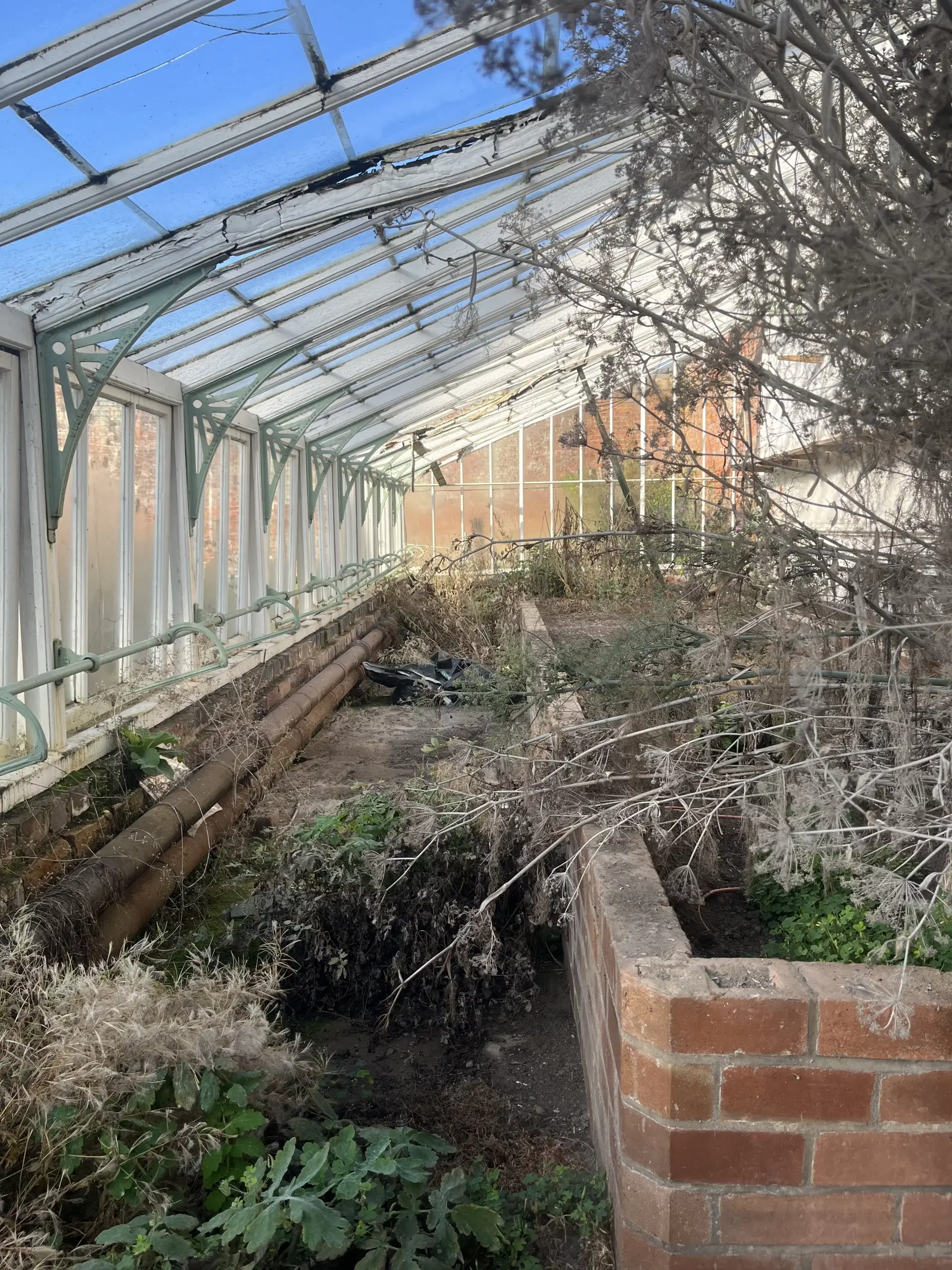
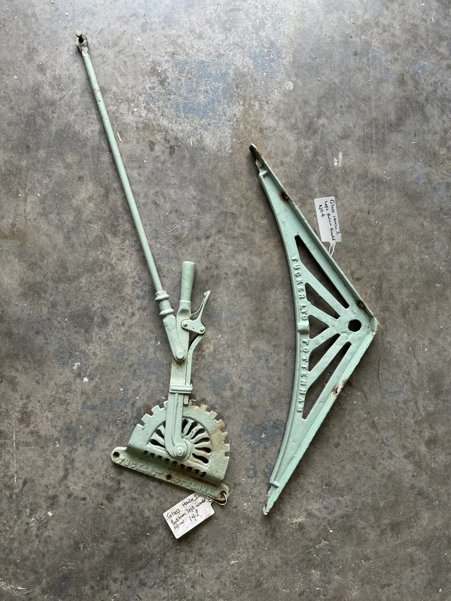
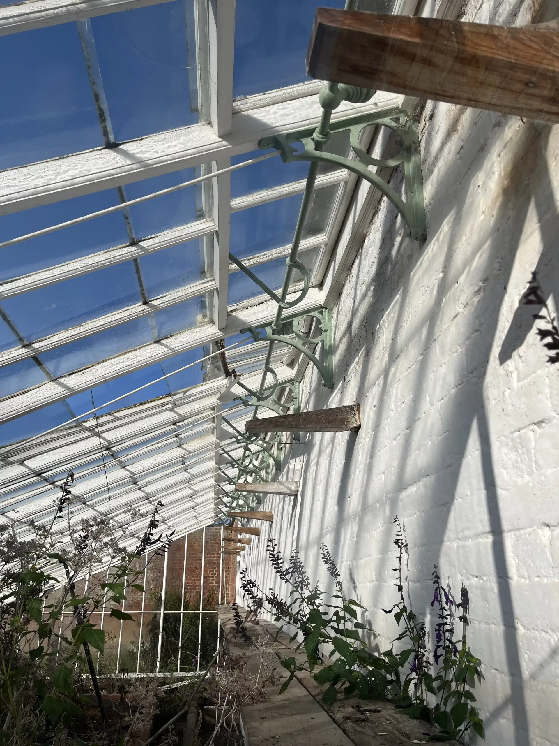
Above; the Tomato House at Attingham Park, Shropshire as we found it in 2023. The glasshouse we replaced was built in the late 2000’s but the ironwork is from the original greenhouses installed in 1924 by Duncan Tucker of Tottenham
Current Trends:
Whilst white will always have a loyal following, it epitomises classic timelessness, optimising light reflection and works as well in a cottage garden as it does in a working kitchen garden or flanking a contemporary property. It will always be a popular option and we note with irony that our White has a slight “Un-Victorian” creaminess to it – it’s not a cold, pristine white.
Currently overtaking white, however, whilst still delivering on classic timelessness and light reflecting prowess, are the off-whites of Ivory, as used on recent glasshouse reinstatements at Attingham Park in Shropshire, for example, and earthier Oatmeal, as demonstrated by the Paradise Garden glasshouses at RHS Bridgewater.
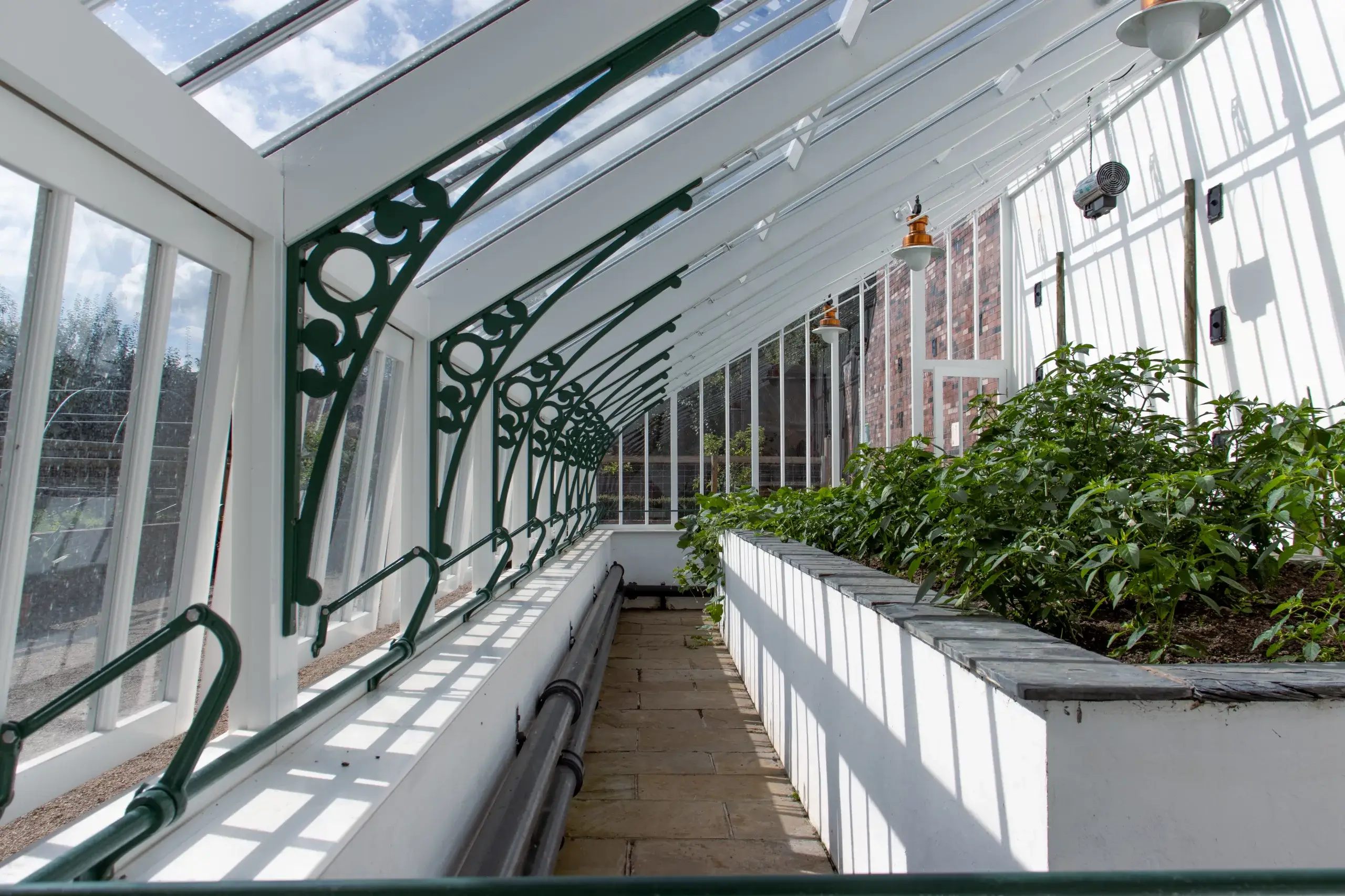
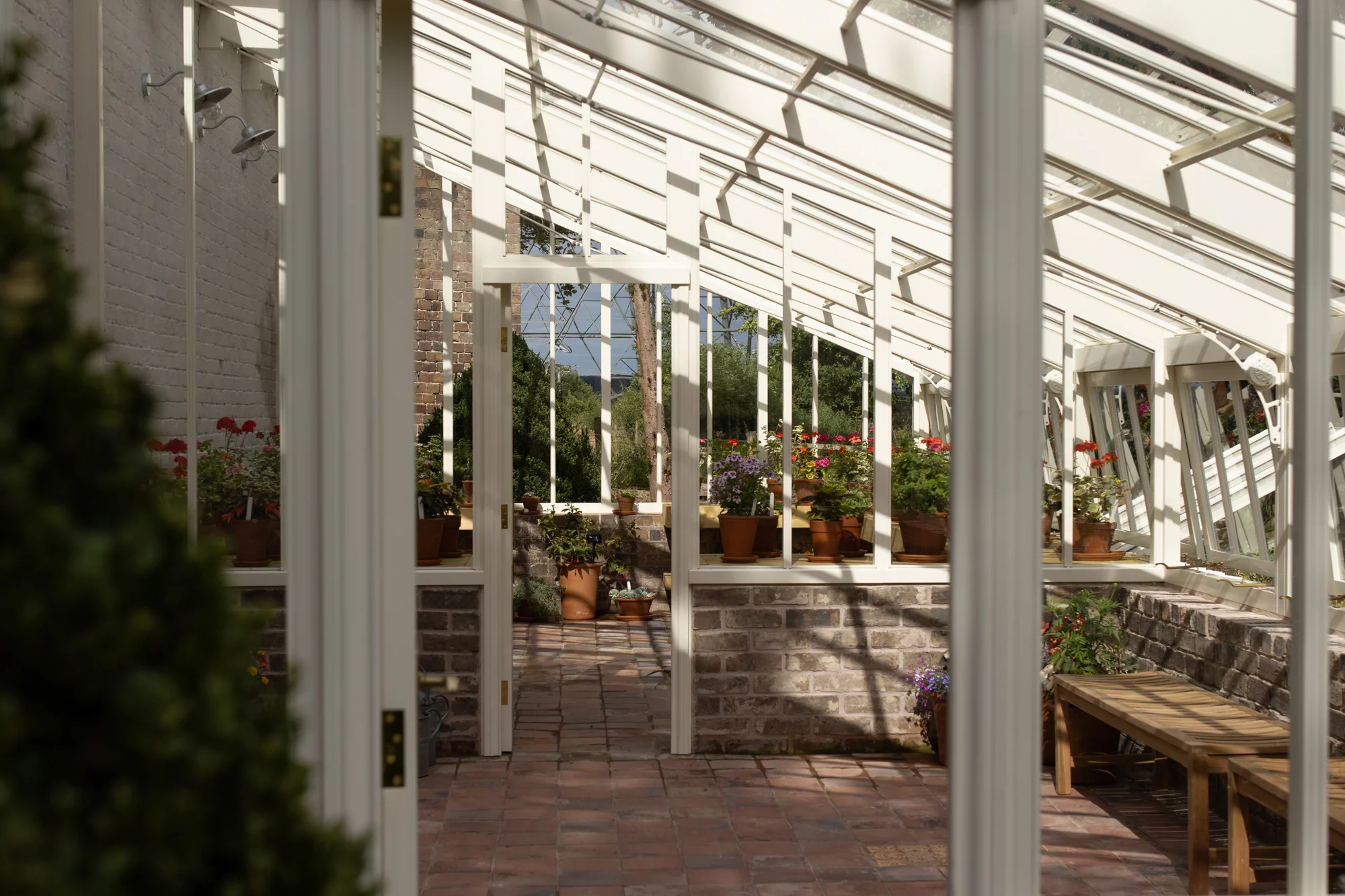
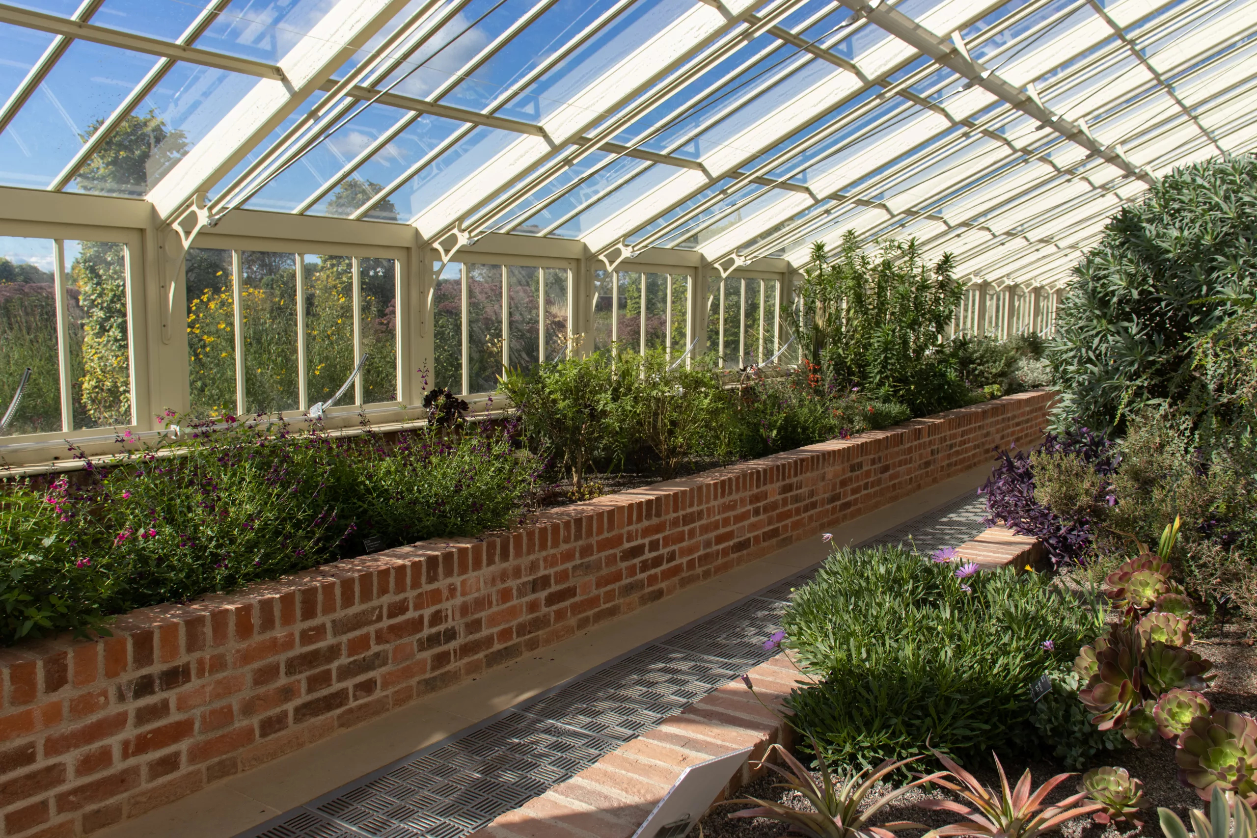
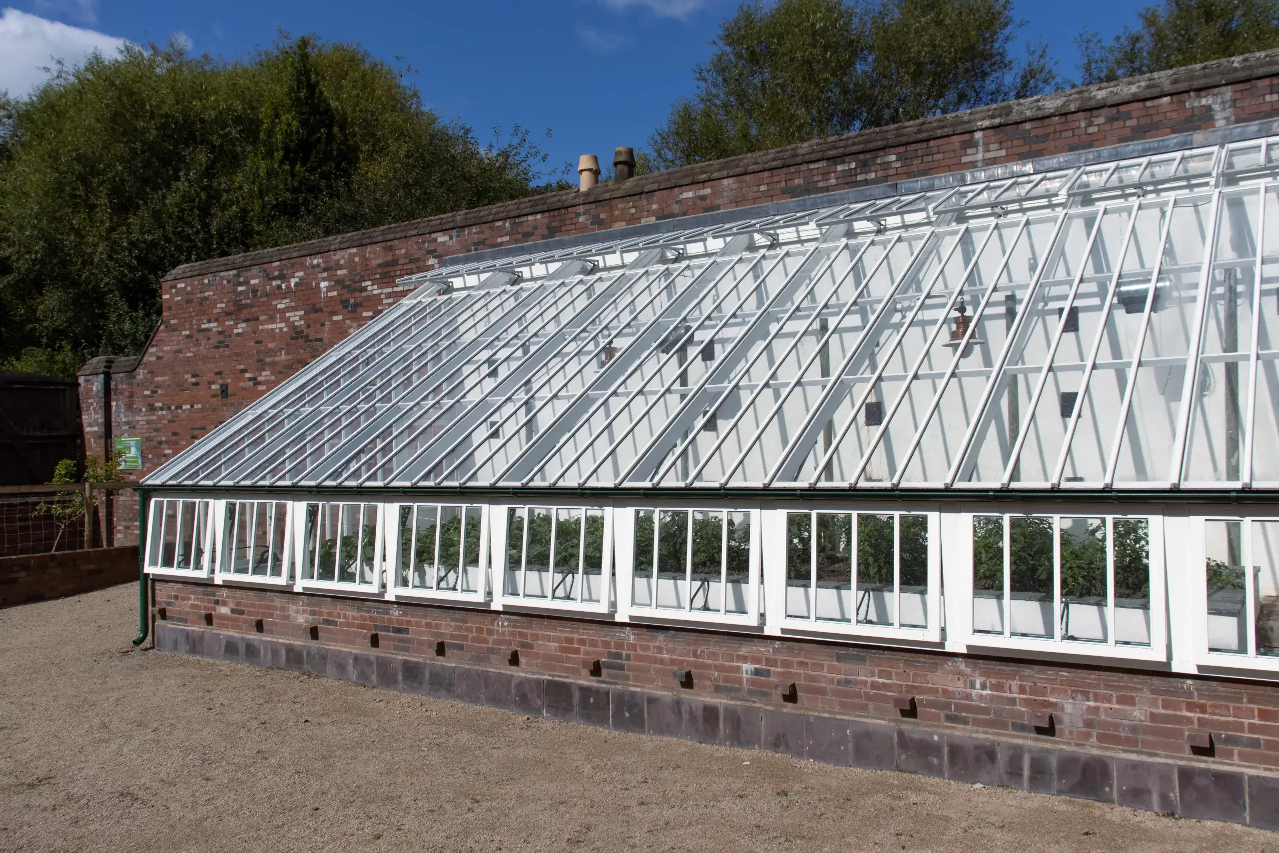
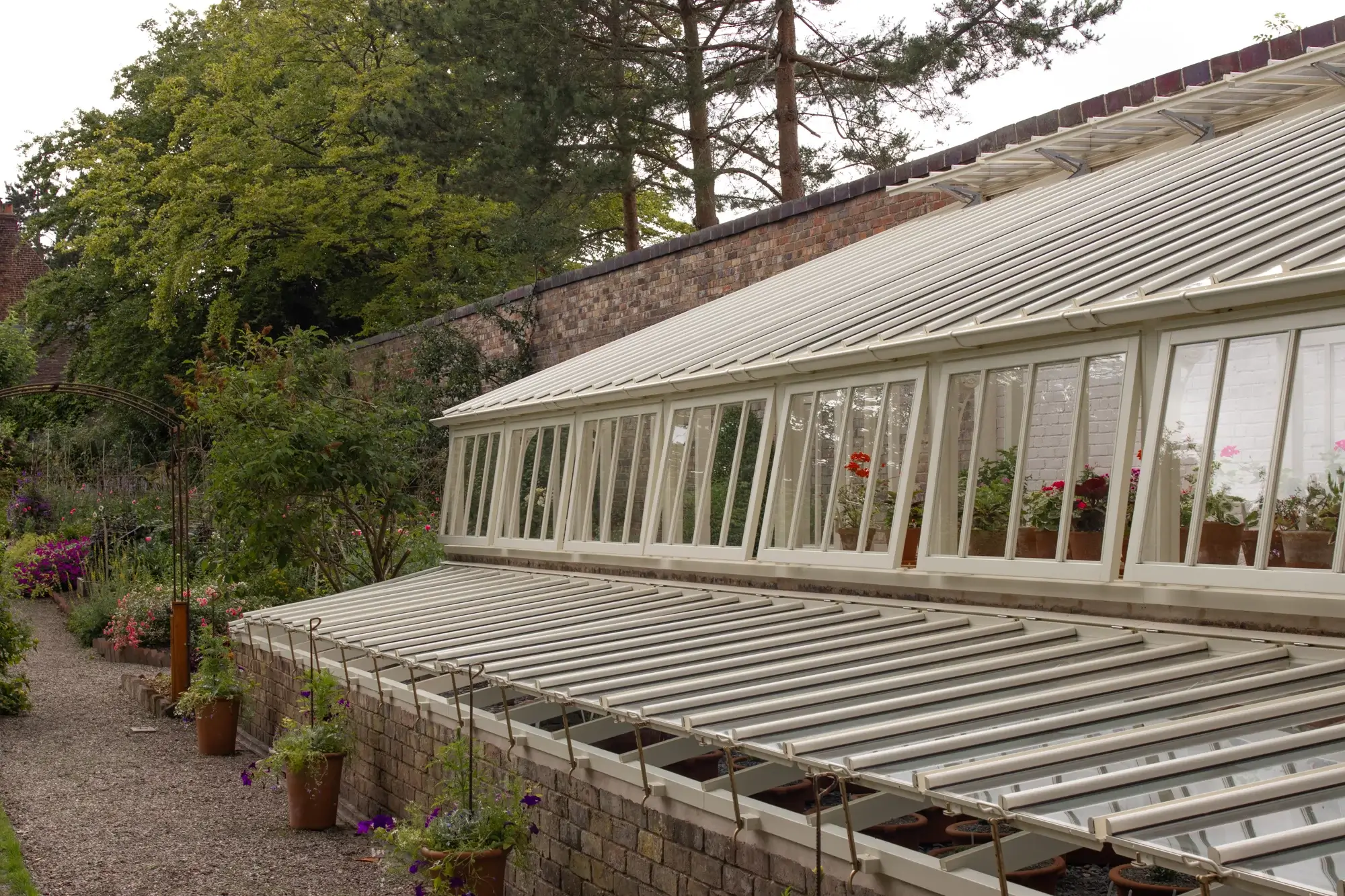
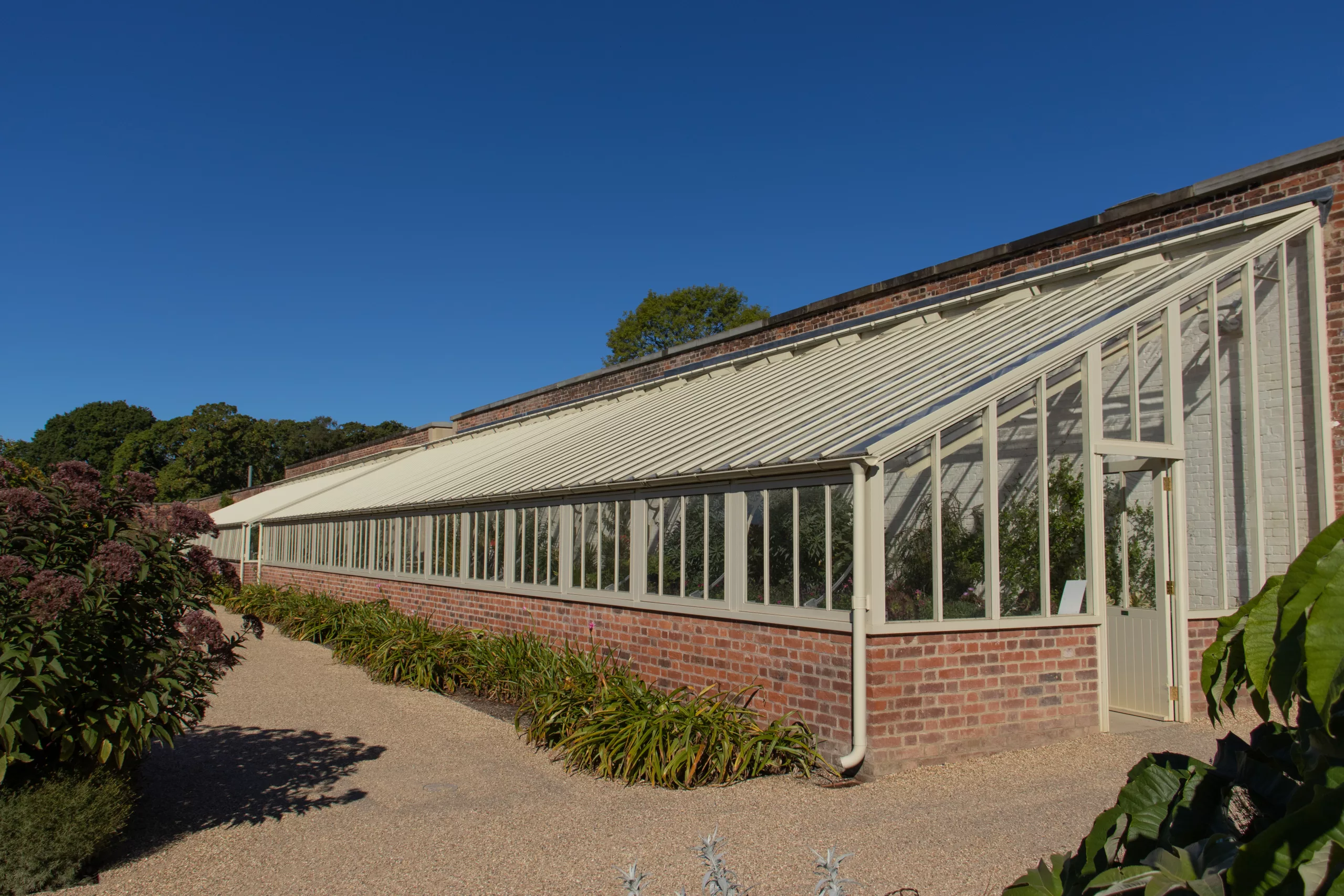
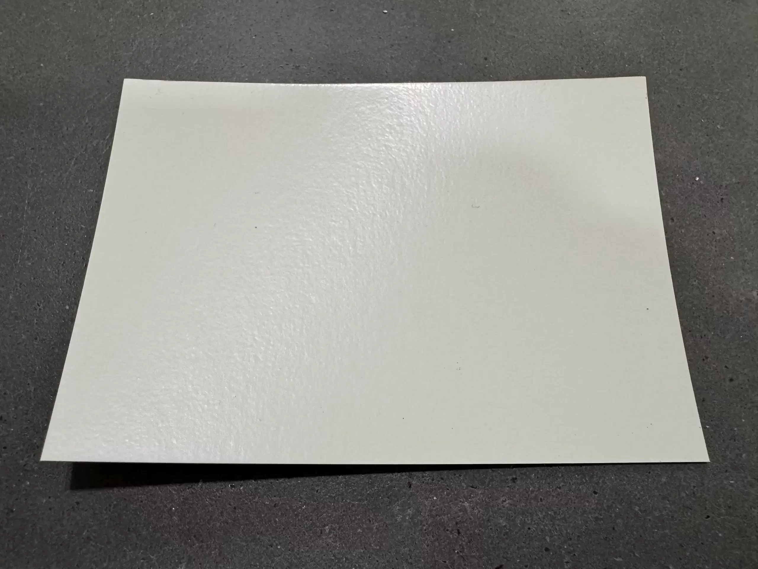
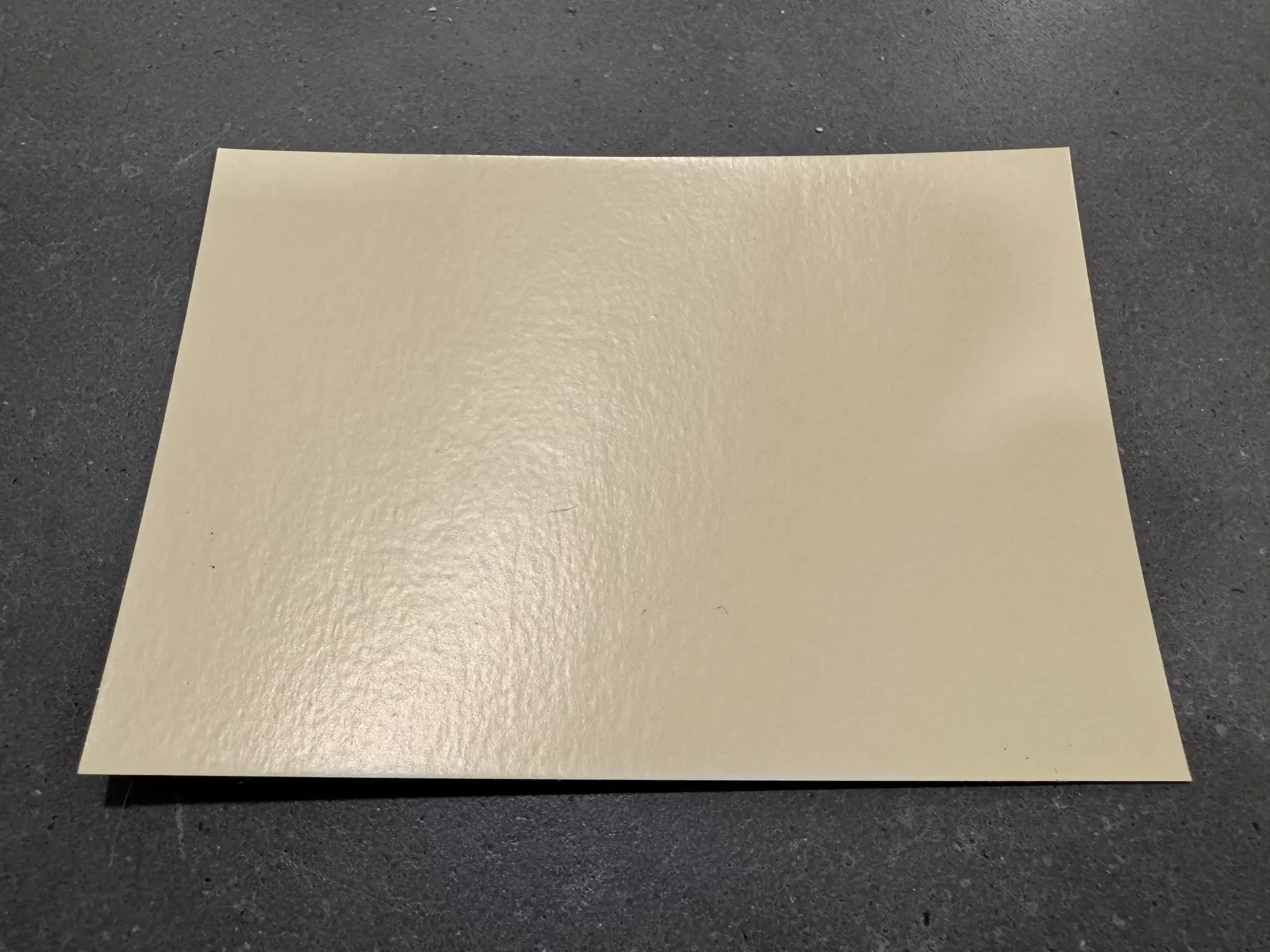
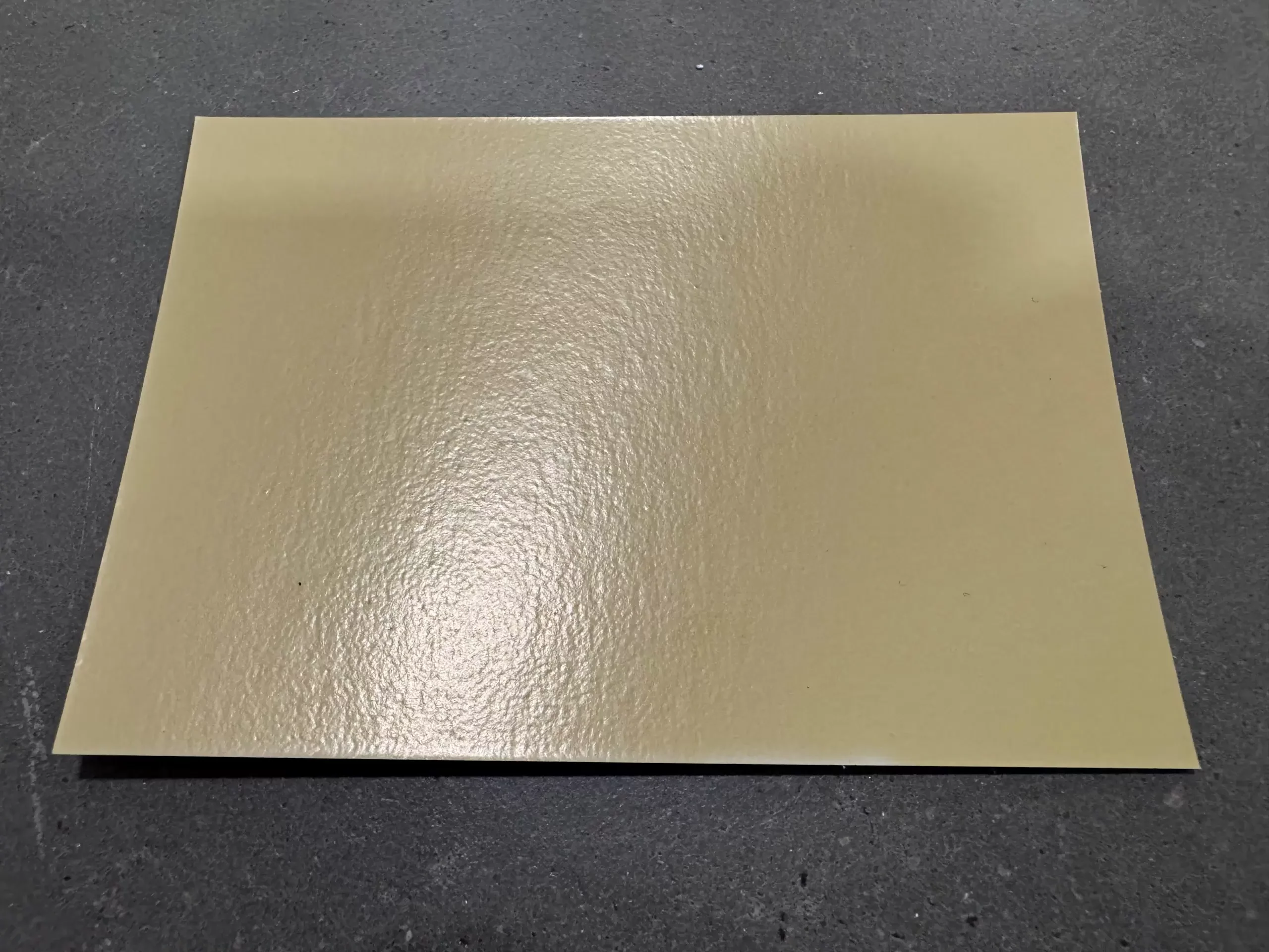
Above left, Sandwell Park, West Bromwich – Victorian mono-pitch lean-to in White. Above centre, Benthall Hall, Shropshire – Victorian mono-pitch lean-to in Ivory. Above right, RHS Bridgewater, Salford – Victorian mono-pitch lean-to in Oatmeal
Bridgewater is a case in point; a historic site with both a horticultural and industrial revolution legacy that has informed design and specification of the site’s contemporary iteration without dictating a slavish copying of what went before. Indeed, the vibe is very much now, the direction forward-facing, and the references to the past subtly reimagined. Our work there has also inspired one of the newest colours in our palette and neatly nudges us into the next category of colours currently enjoying favour – the mid-tones.
The mid-tones include Lizard Grey, Moorland, Pebble Grey and Puddling Clay (the name comes from the material used to line canals and is inspired by RHS Bridgewater and its relationship to the Bridgewater Canal). All 4 of these colours have been hugely popular in recent years and do similar jobs in your garden, sinking into the landscape rather than demanding attention and blending harmoniously with all sorts of other building materials including reclaimed brick, sandstone, granite and limestone.
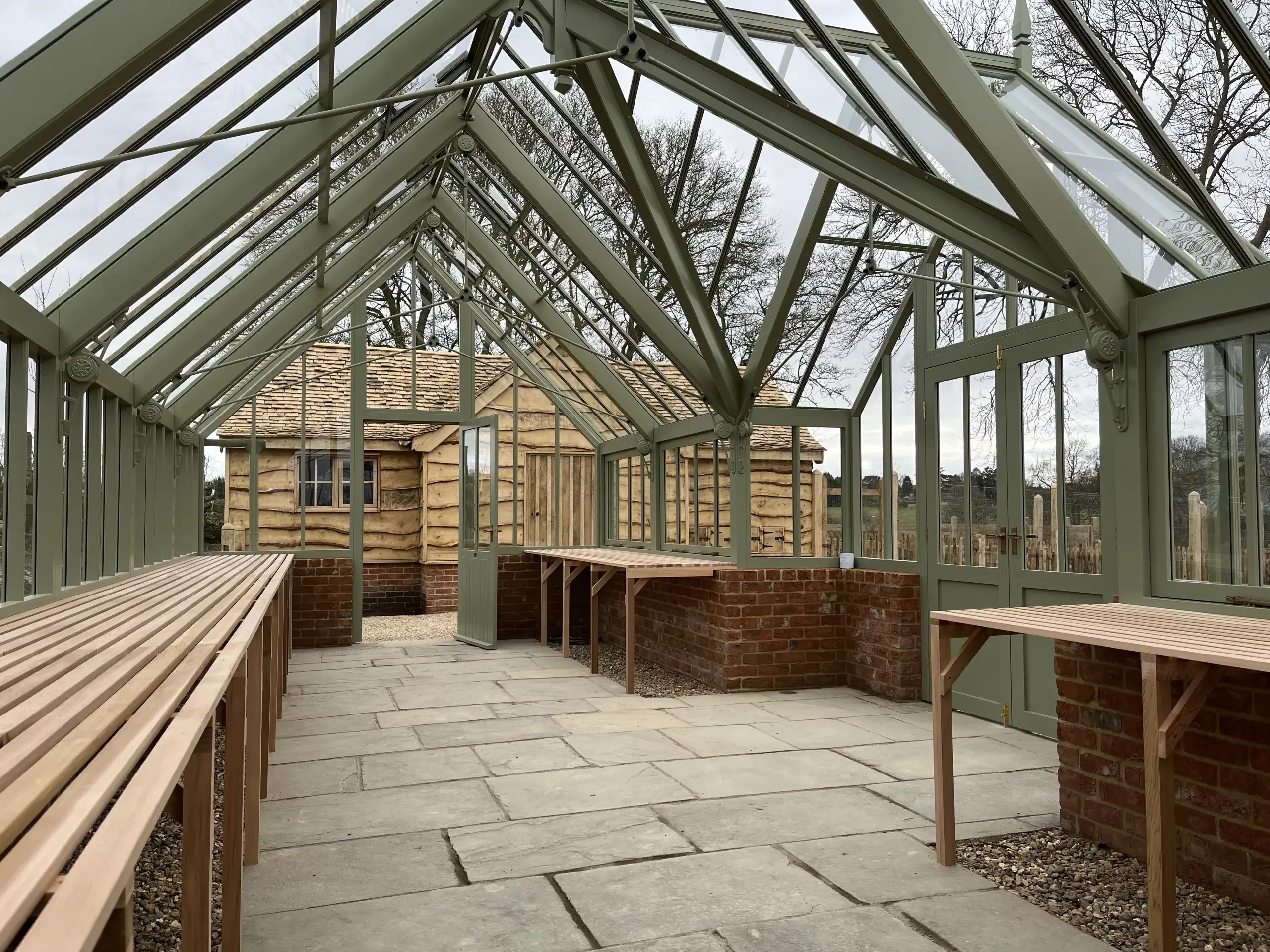
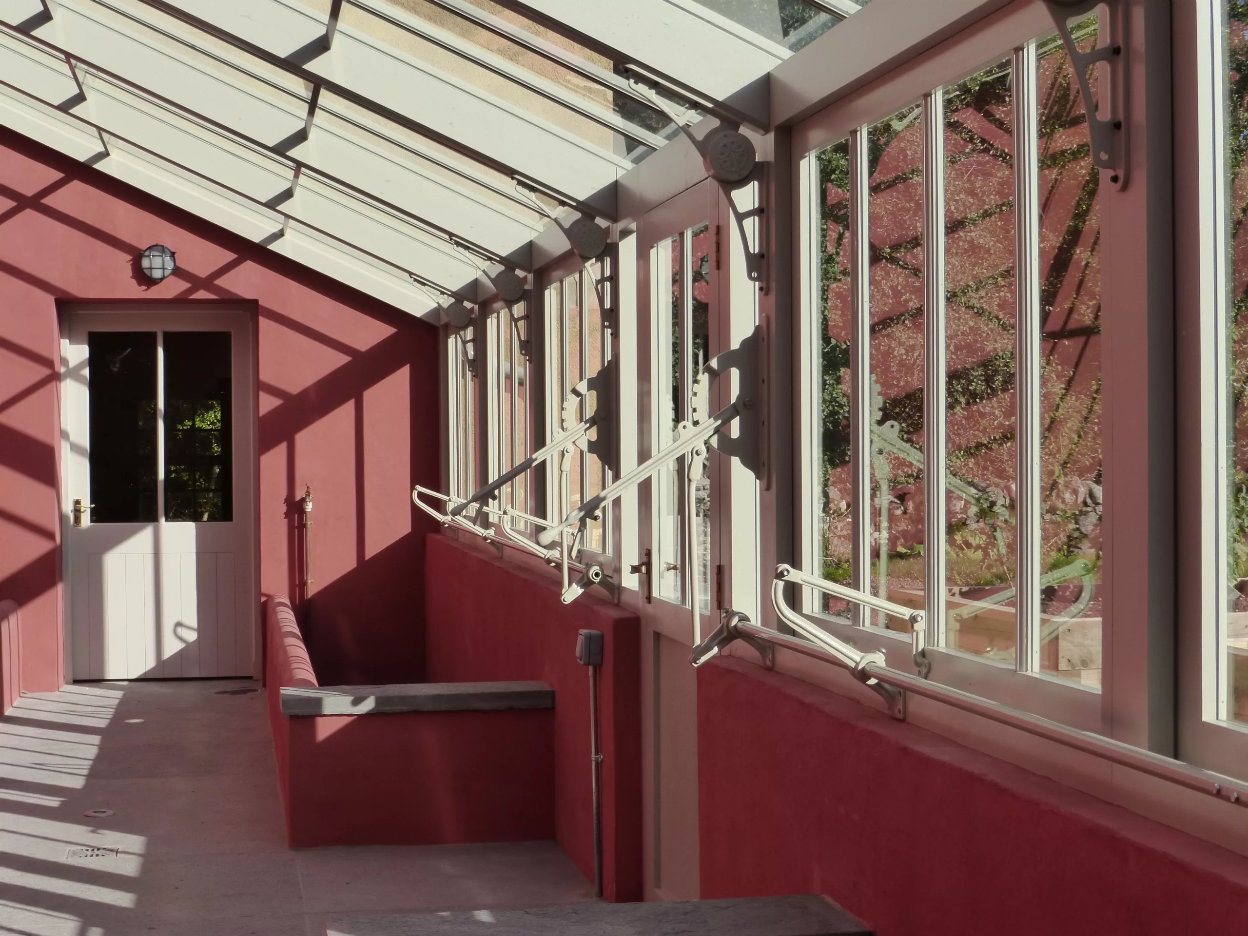
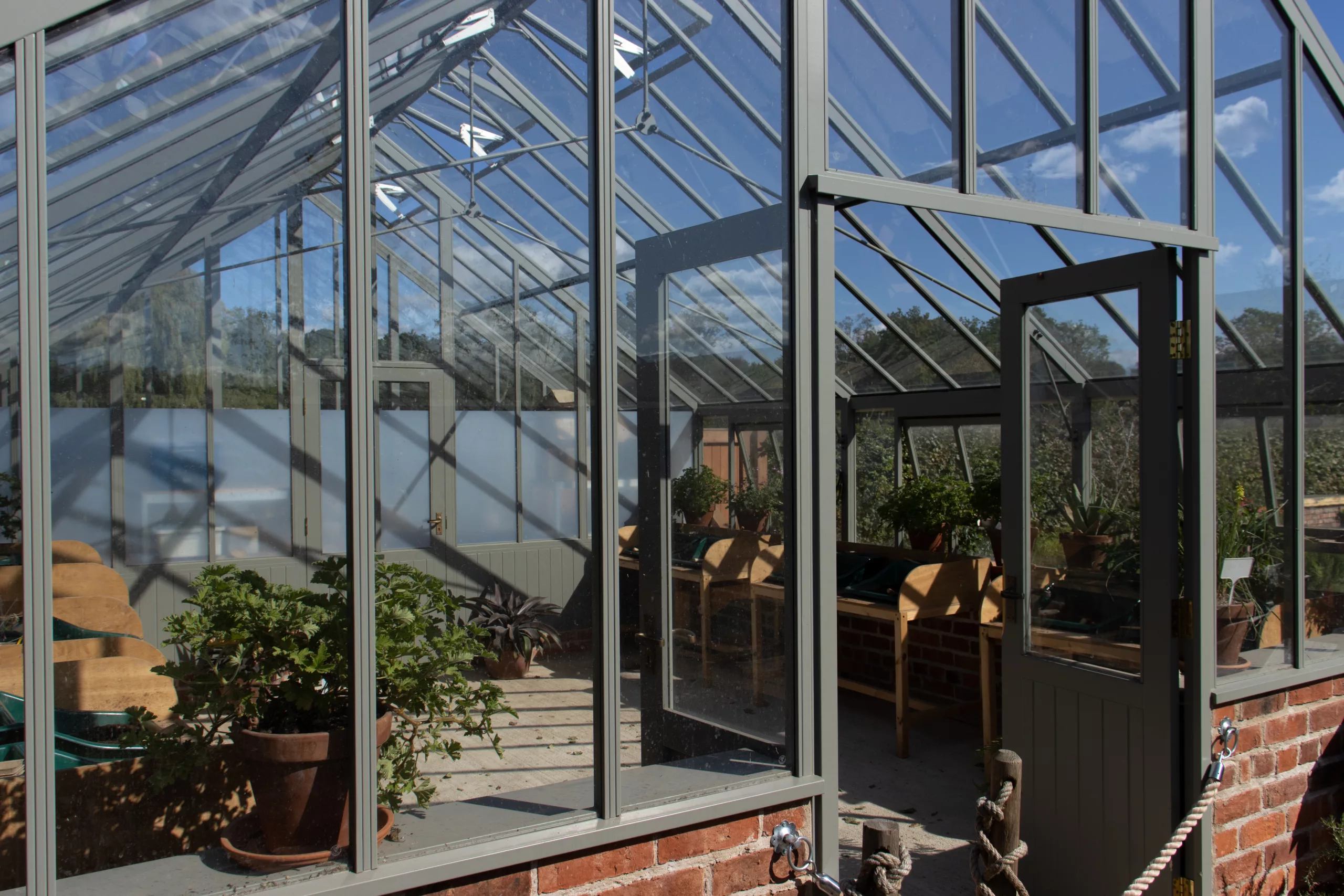
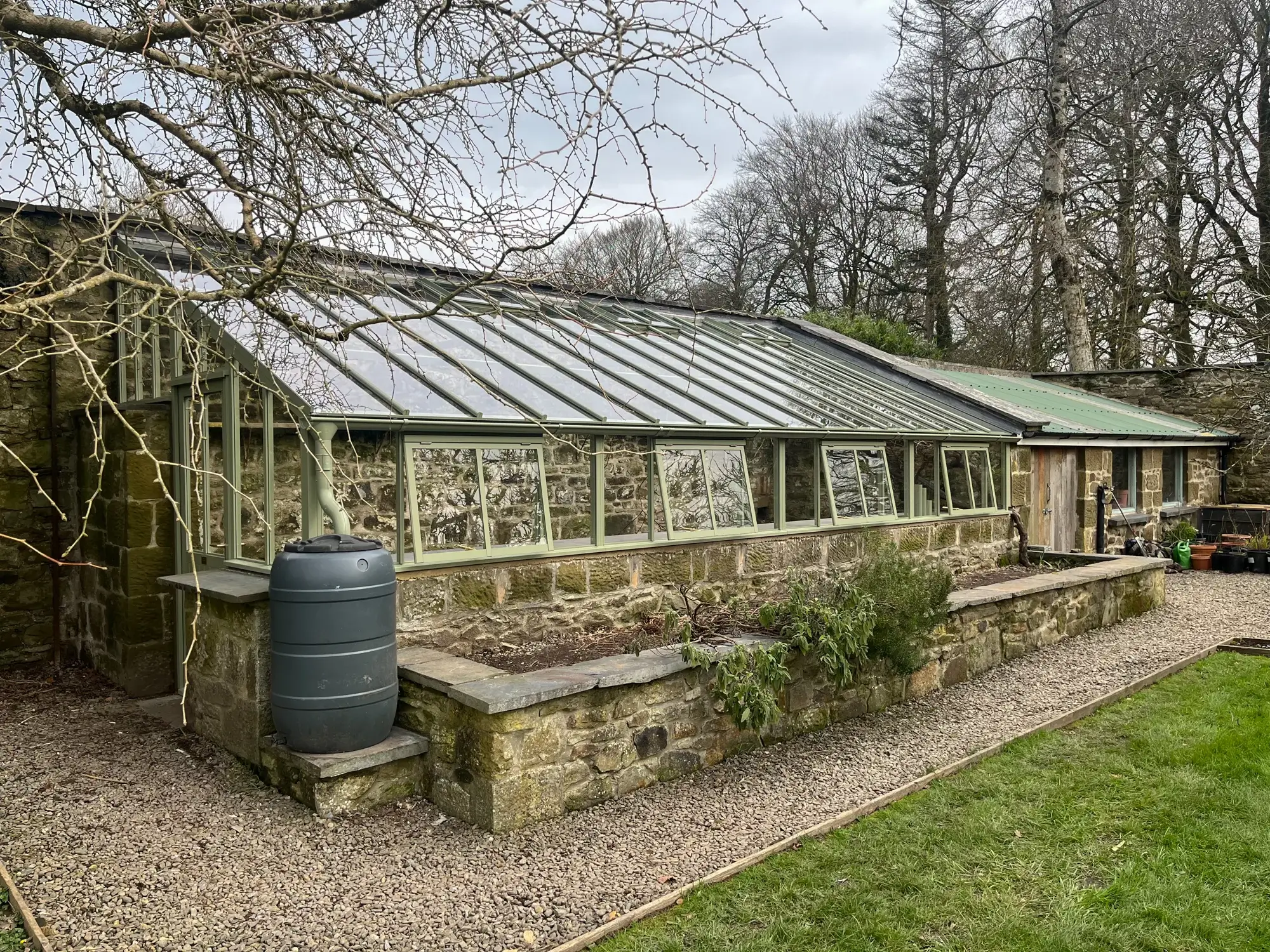
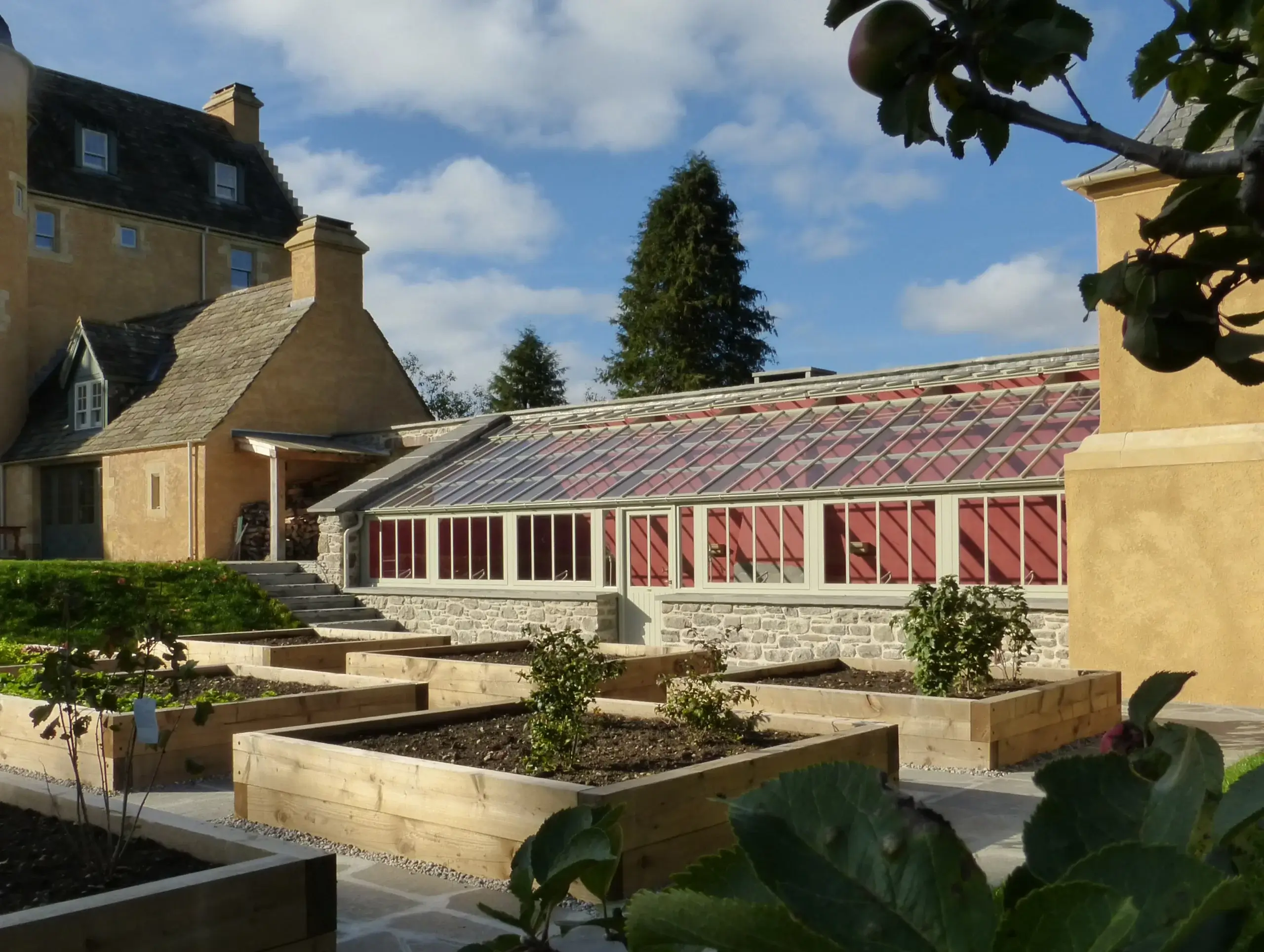
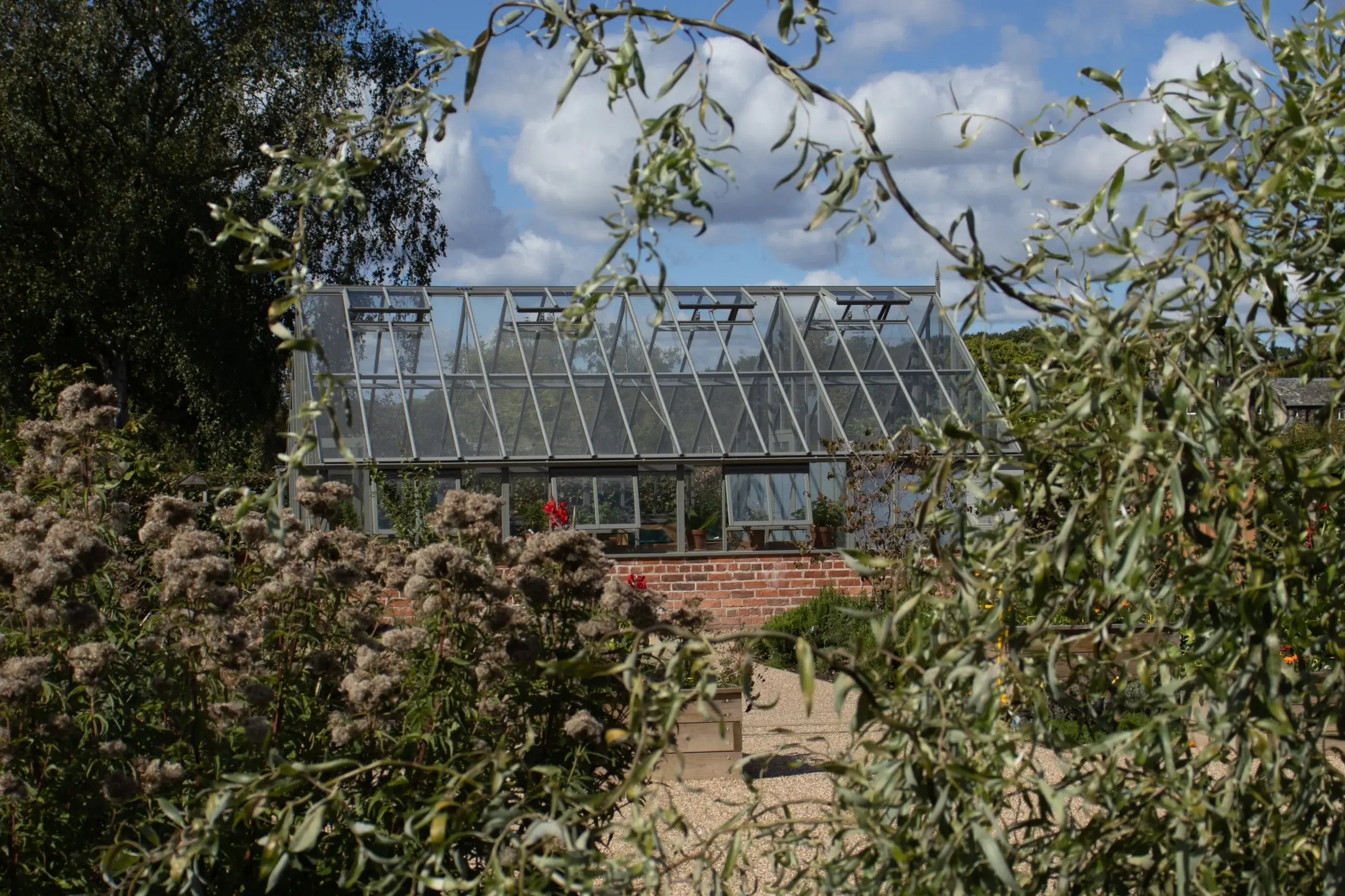
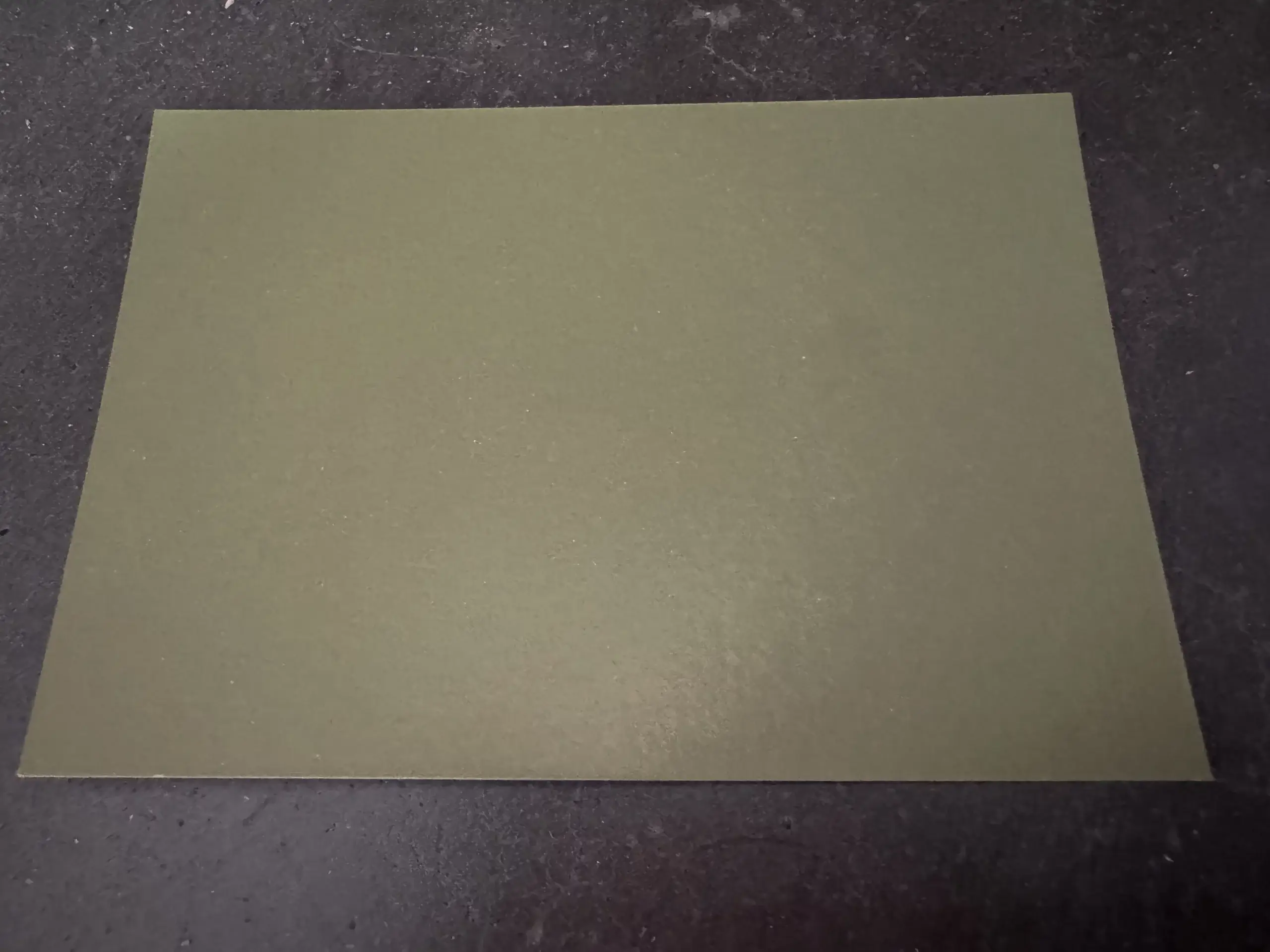
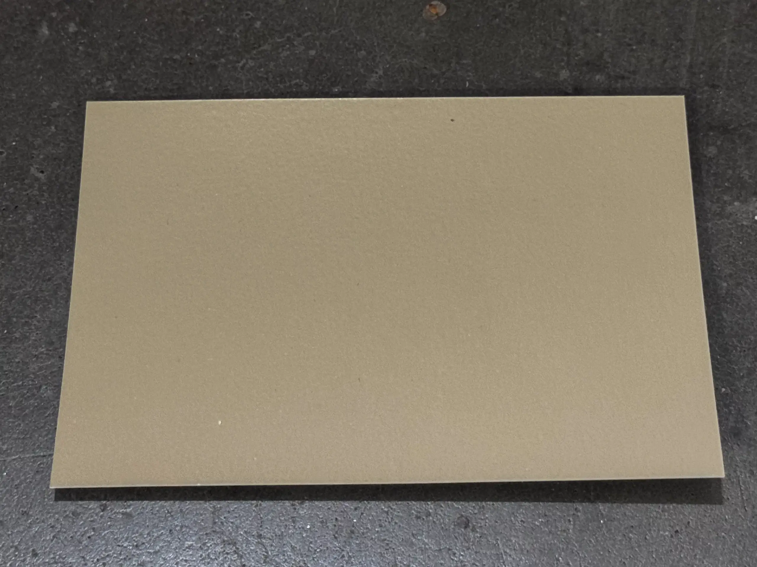
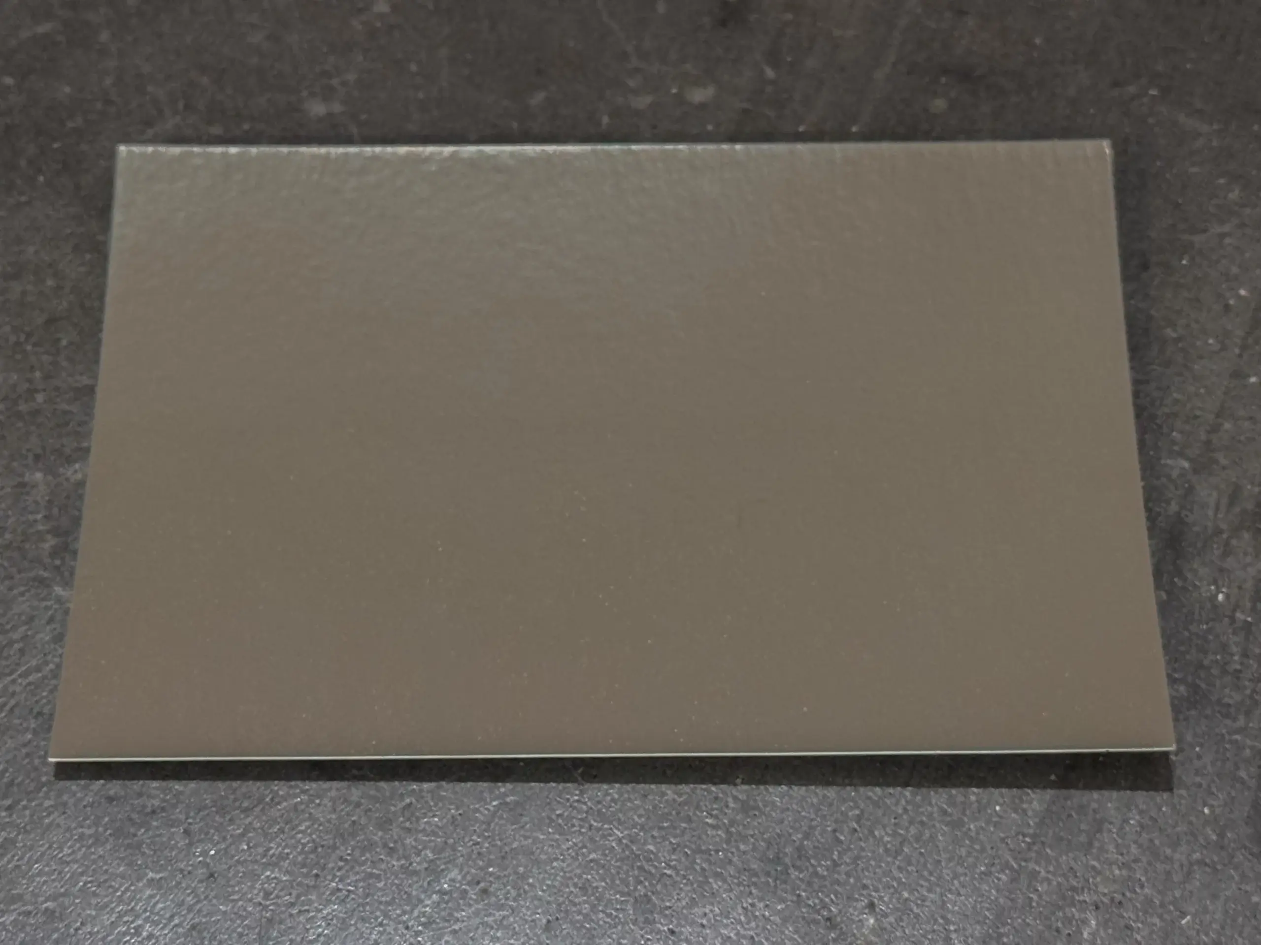
Above left, Moorland (top: Victorian, centre: Edwardian mono-pitch). Above centre, Victorian mono-pitch lean-to in Pebble Grey, Scottish Highlands. Above right, Edwardian freestanding at RHS Bridgewater in Puddling Clay
Whilst how the greenhouse feels inside or sits against its backdrop in the landscape are the key concerns of some, others need uniformity and in this case, the greenhouse colour is often dictated by the choice of colour used elsewhere on the property – the ‘estate colour’ – and there’s no doubt that this realm has been heavily influenced by British paint makers who have cast their nets wide in search of inspiration for new colour and have evocatively and imaginatively seeped into everyday parlance whenever the conversation turns to colour. We don’t need to mention the proverbial mammals’ breath in the room, do we?
In the 90’s it was fashionable to fit mahogany window frames in the home – we had them, along with our sage green bathroom suite, and we got rid of them in favour of white for both about 15 years later when the previous, once excitingly chic choice began to fail the test of time! But now there’s a new trend on the home fenestration front – dark grey or Anthracite, as RAL, the European colour matching system for paints, coatings and plastics used widely across the construction industry, have dubbed it. Queue the demand for greenhouses in this colour too. Right now, this feels modern and cool but will it last? Remember, a greenhouse colour is for life (well, many years at least), not just a growing season.
And let us not forget black; the spectral opposite of white and the fashion staple seasonally dethroned by the fashion media in favour of the latest ‘new’ neutral. But historically black was never a thing in the world of greenhouses. It’s black! That’s crazy! Or is it? Is black the new white?
(Tip: ignore fashionistas. According to them Leopard print is a neutral – don’t ask us for this, we can’t do it and we won’t try).
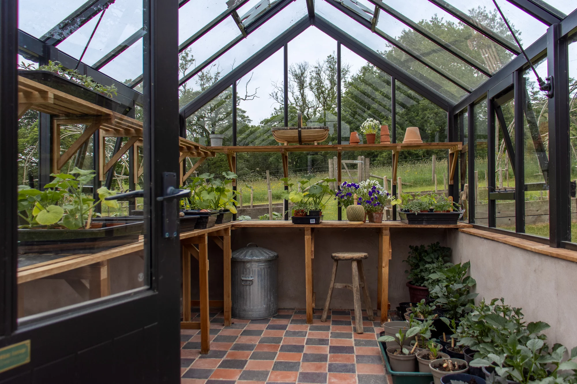
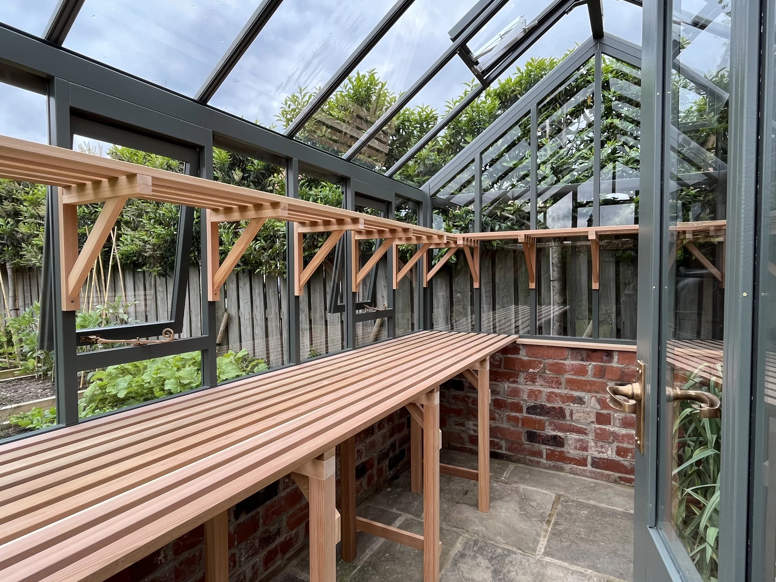
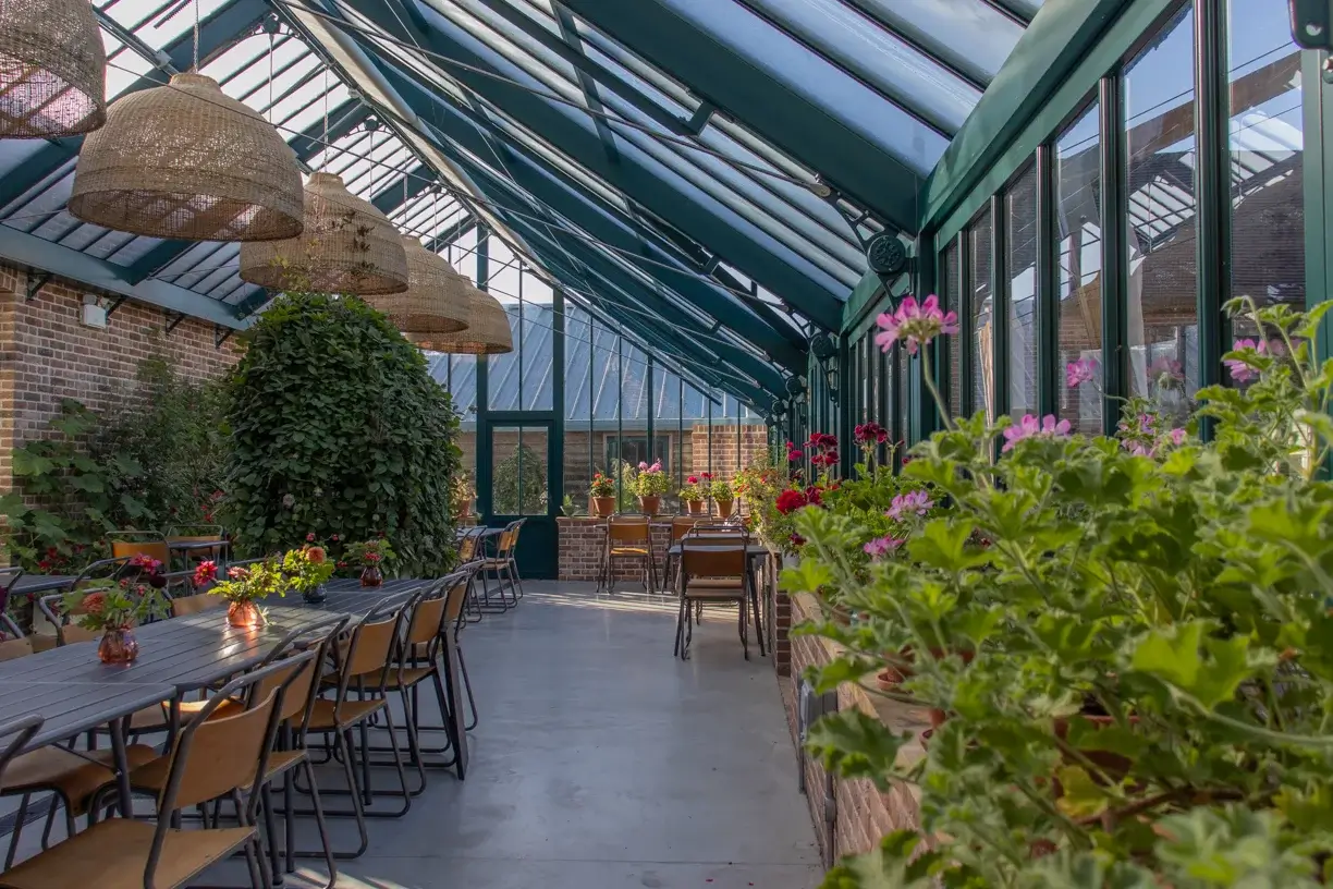
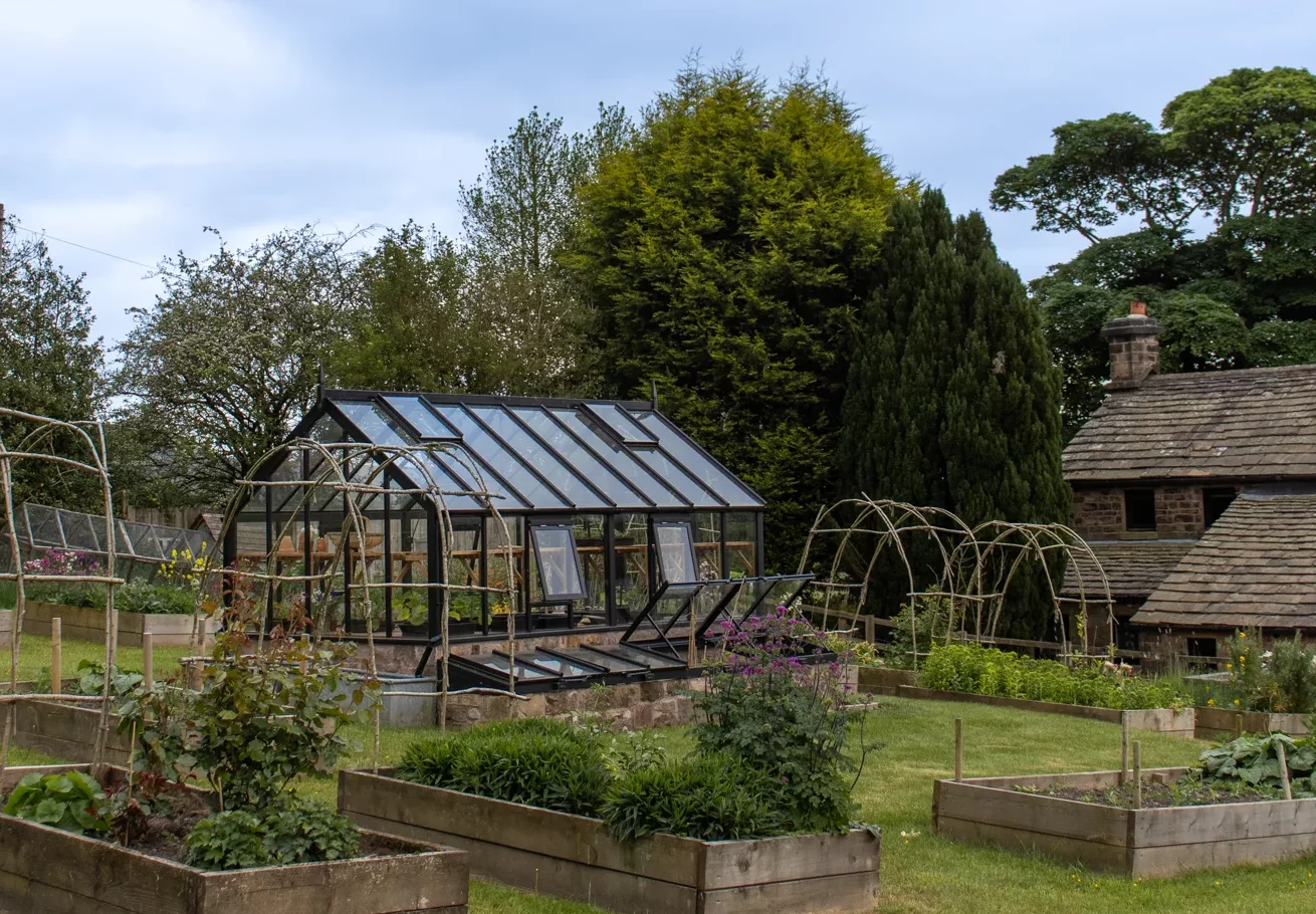
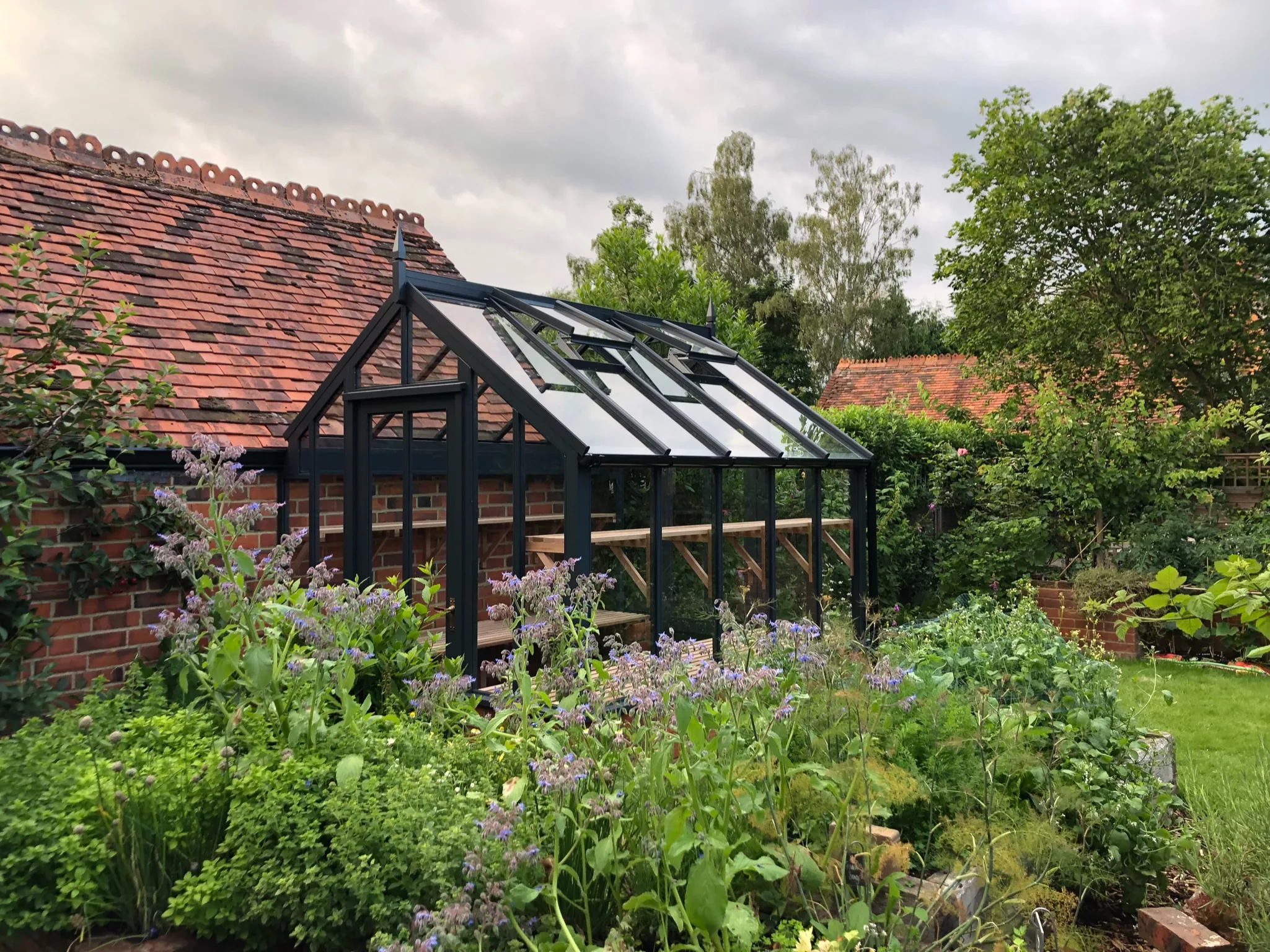
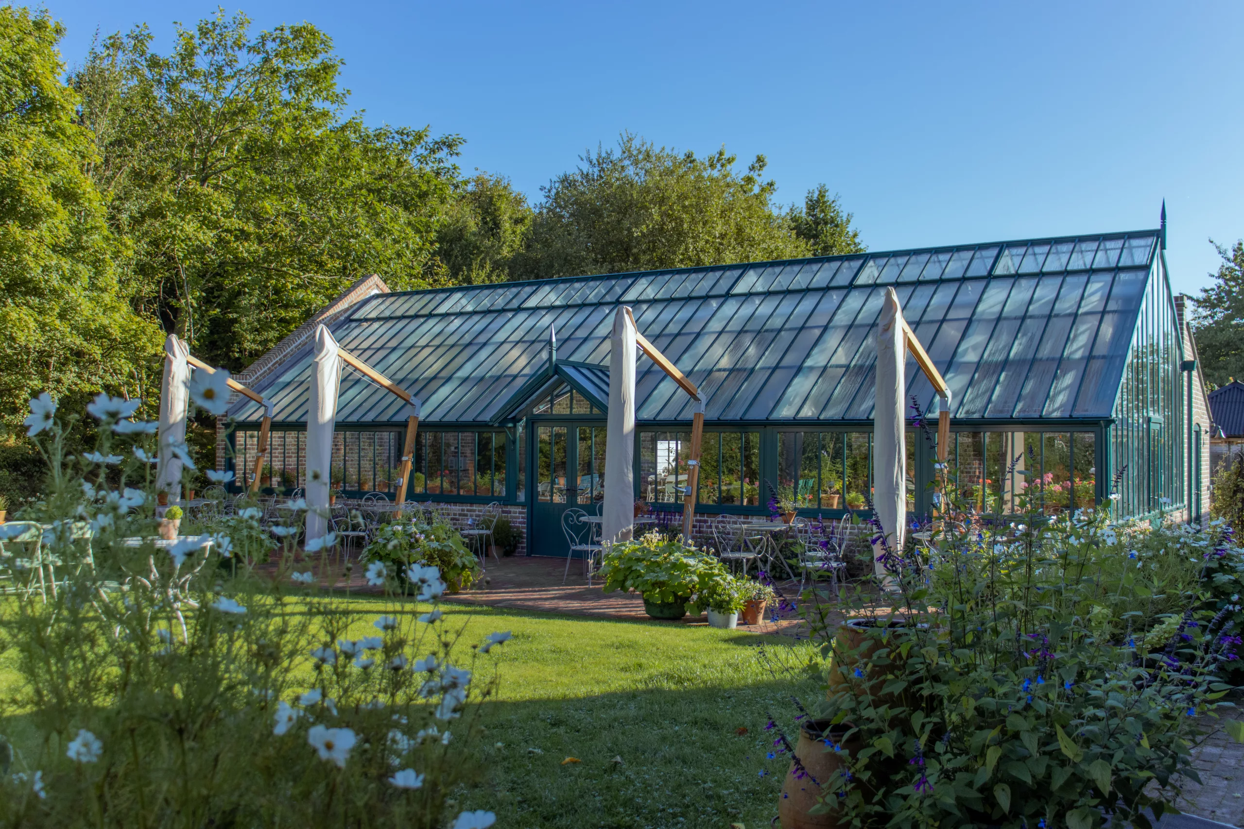
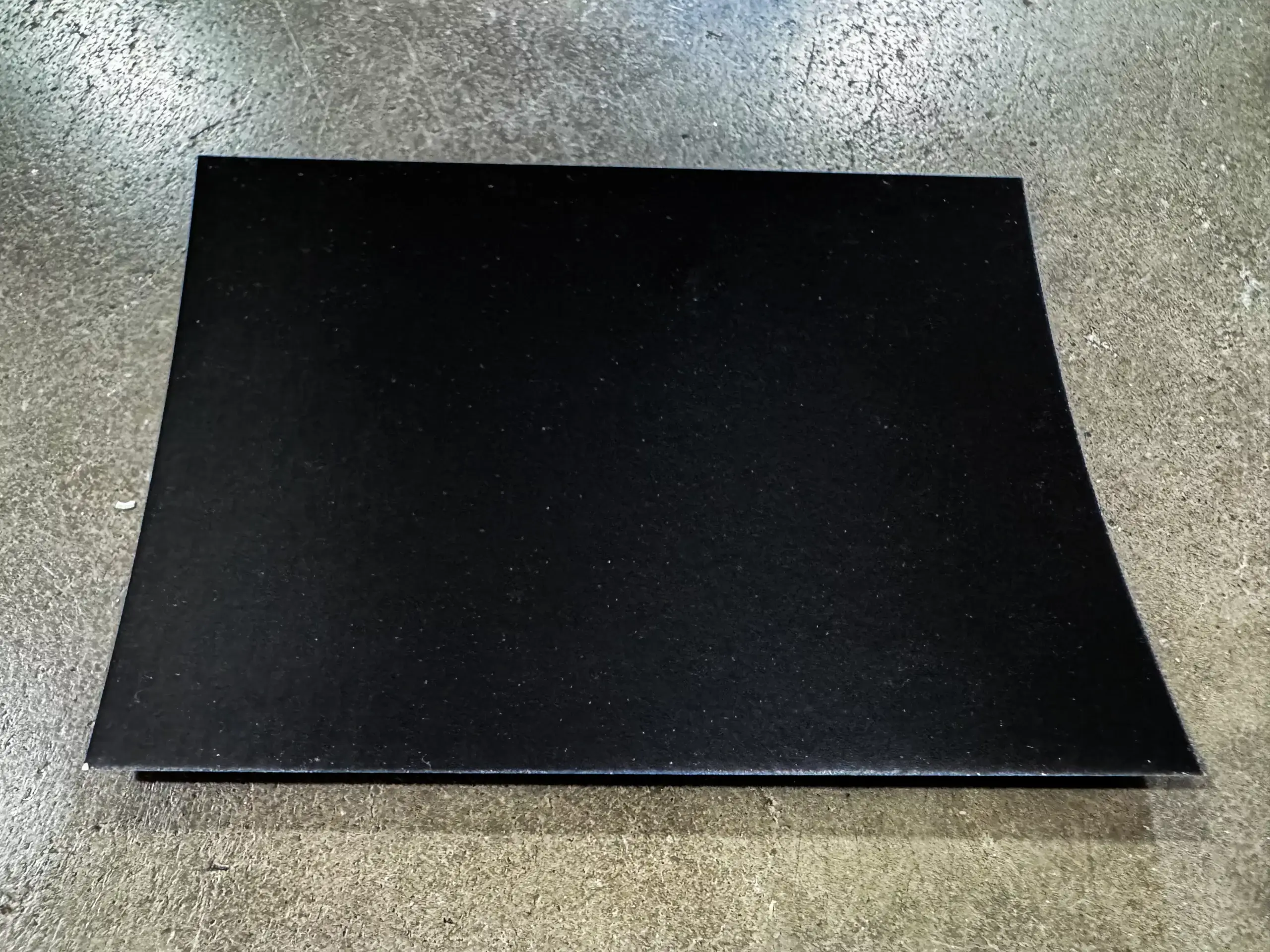
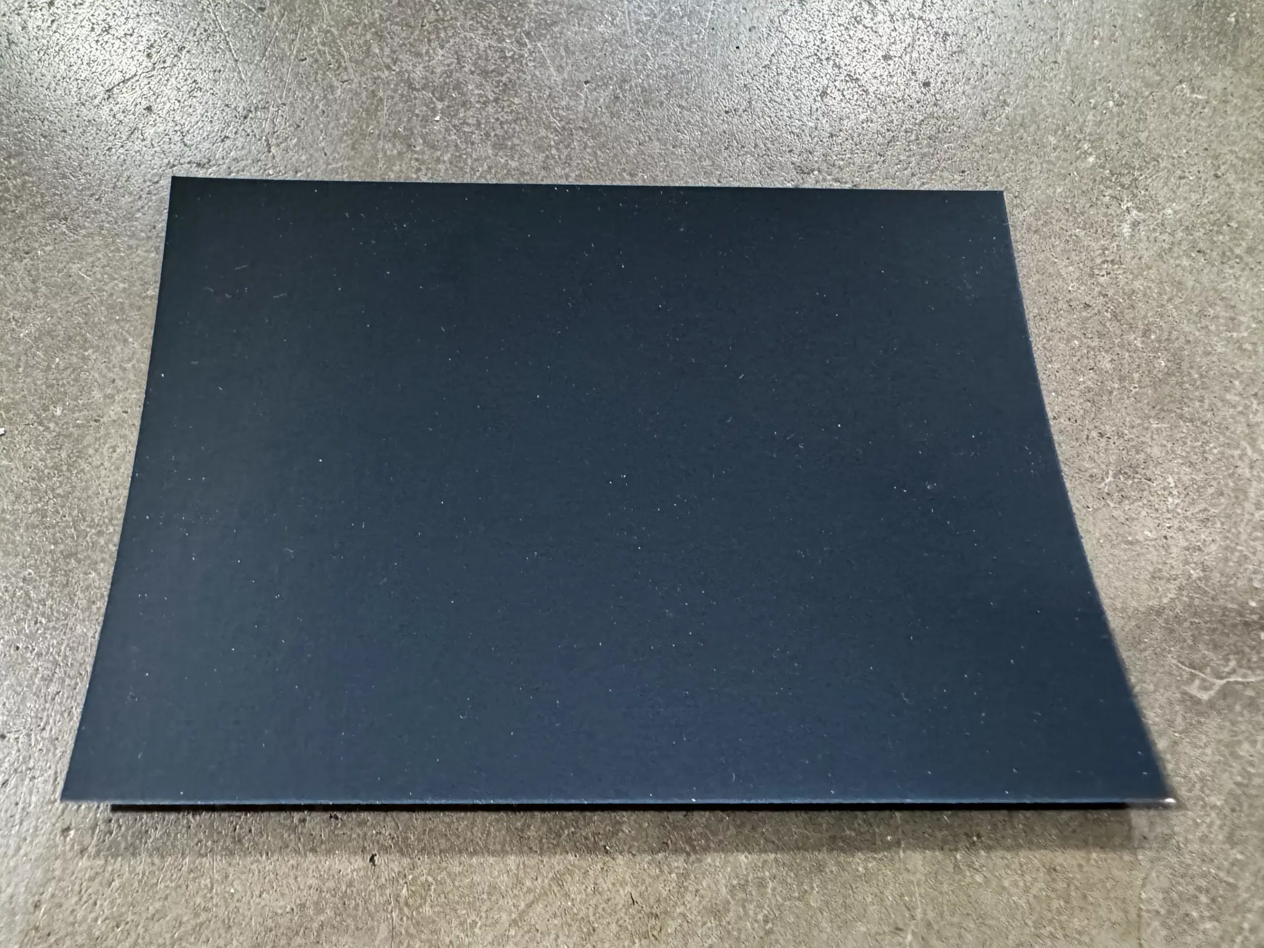
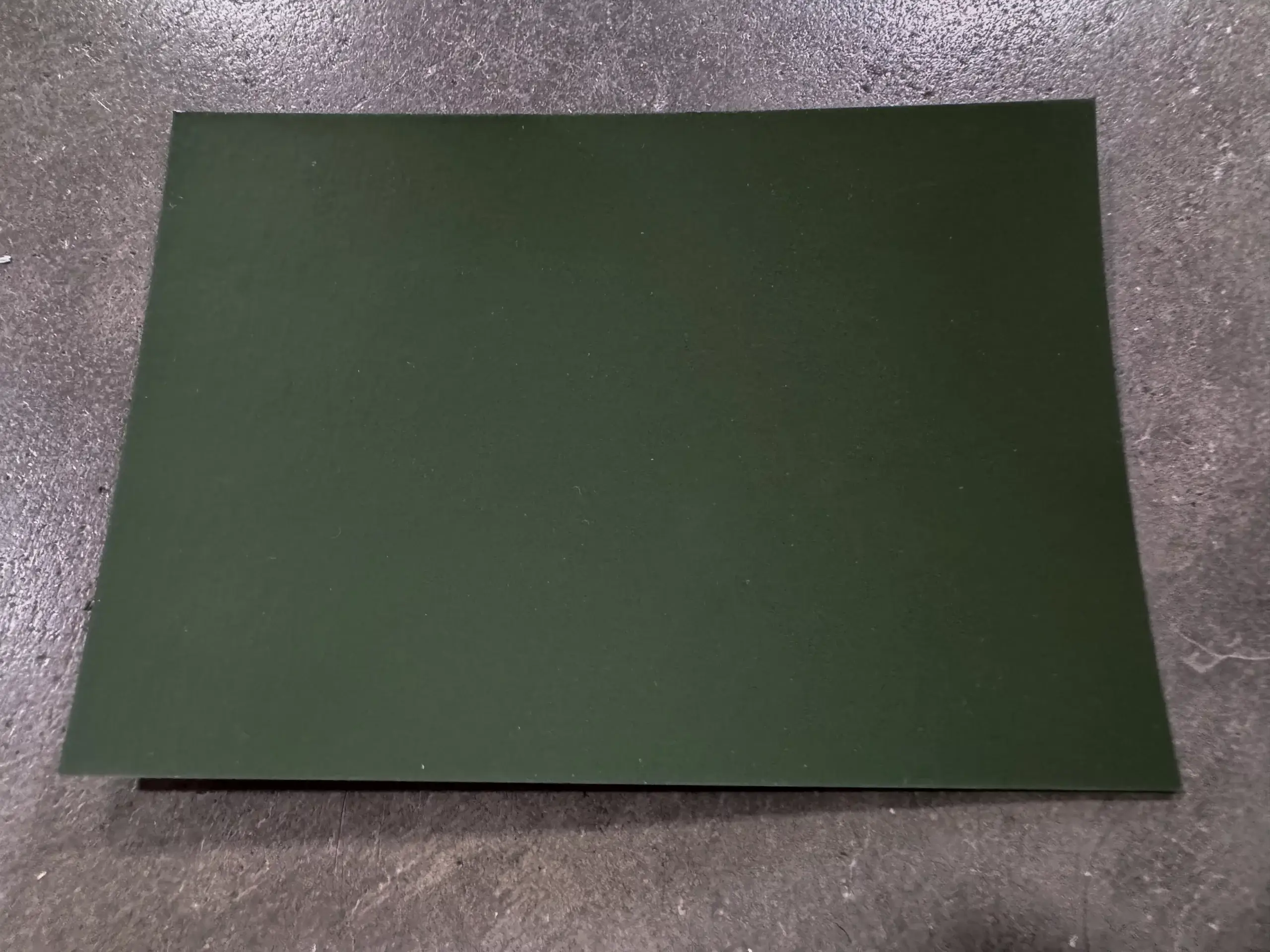
Top left, the Arley in Black. Top centre, Edwardian three-quarter span in custom colour Tarpaulin Grey (RAL 7010). Top right, Victorian three-quarter span in custom colour Blue Green (RAL 6004). Centre left, the Arley in Black. Centre, Edwardian three-quarter span in Anthracite. Centre right, Victorian three-quarter span in custom colour Blue Green (RAL 6004). Bottom left, Black. Bottom centre, Anthracite. Bottom right, Olive Green.
Dark colours absorb solar energy rather than reflect it, but does this really make a difference in a greenhouse? We don’t have a scientific answer to that. We’d have to build 2 greenhouses exactly the same and put them next to each other in exactly the same aspect, exposure to weather etc and monitor the conditions within to find out. So far, no one has given us the excuse to do that so, while we wait for that brief to come in, it’s down to personal preference.
Longevity
The obvious concern with a painted wooden greenhouse is its longevity and how to keep it looking good for many years. Step one in addressing these concerns is to choose an appropriate timber. As mentioned, the Victorians were happy to work with a range of timbers but they did know that a resin-high, smooth-grained wood of tropical origin was inherently longer lasting than a soft wood and they weren’t concerned with deforestation, bio diversity loss and the climate emergency. This is where we now respectfully take a different view.
We talk more about our choice to only use Accoya wood here so we won’t dwell on that too much further here but we should say that it was our paint supplier who first introduced us to the benefits of Accoya as they supported us battling with the challenges of painting Western Red Cedar; the timber we used to use and is still used by plenty of other greenhouse makers to this day. Cedar is a fabulous wood and is a great choice for greenhouses with its natural rot resistance and easy availability from certifiable origins. But the properties that make it good (rot-resistant) also make it difficult to paint. The resins continue to surface long after it’s been painted and solvent-based paints were, unfortunately, the best way of dealing with this. The poisonous ingredients we mentioned earlier kept the resins at bay and made sure the colour you had chosen stayed true for many years.
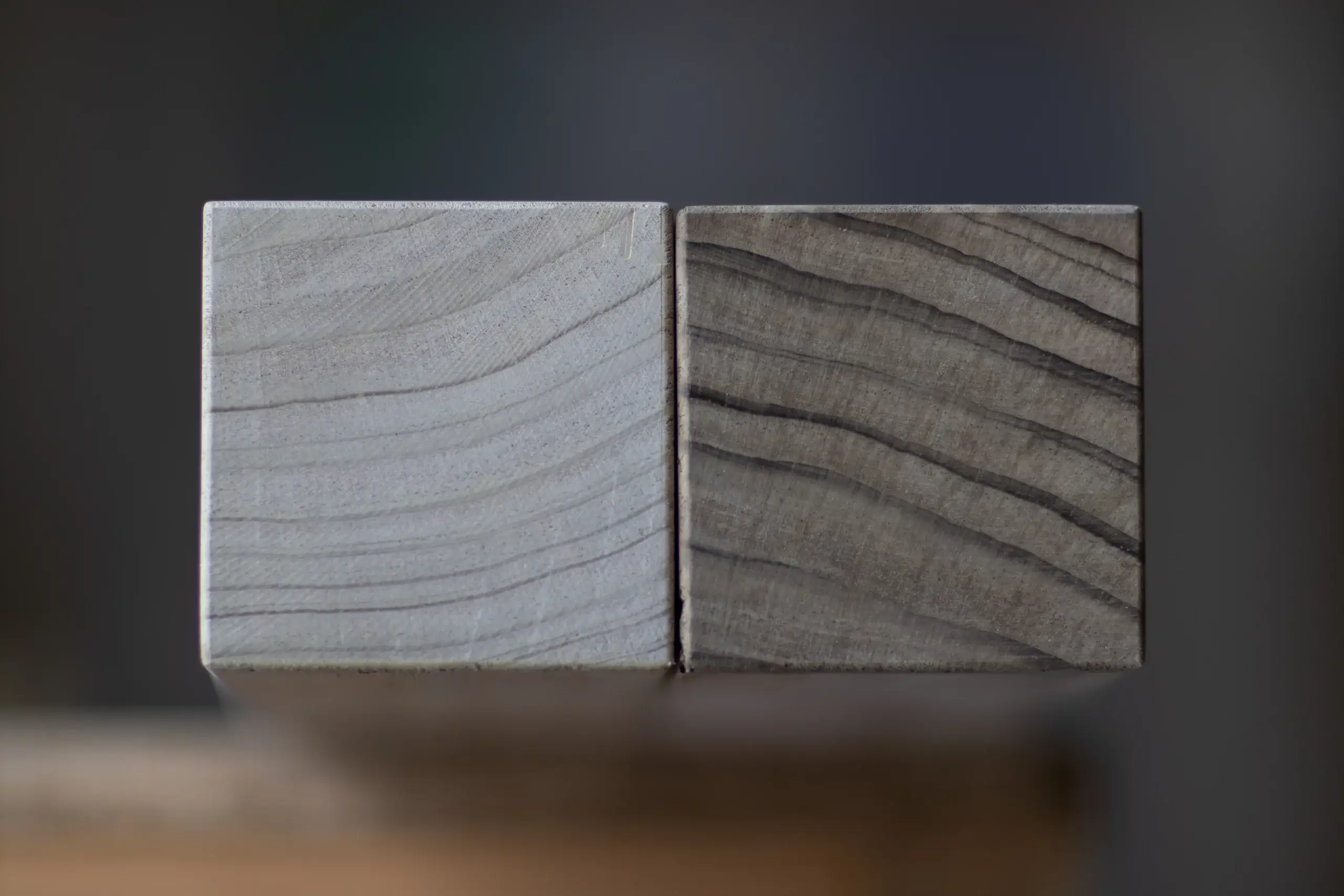
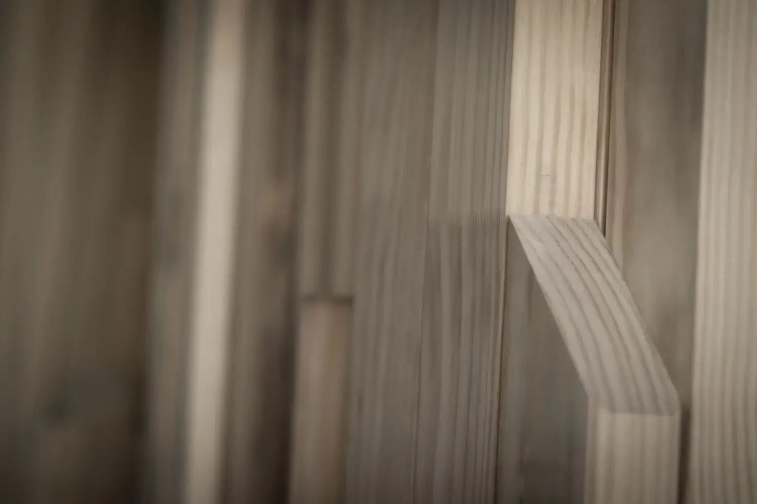
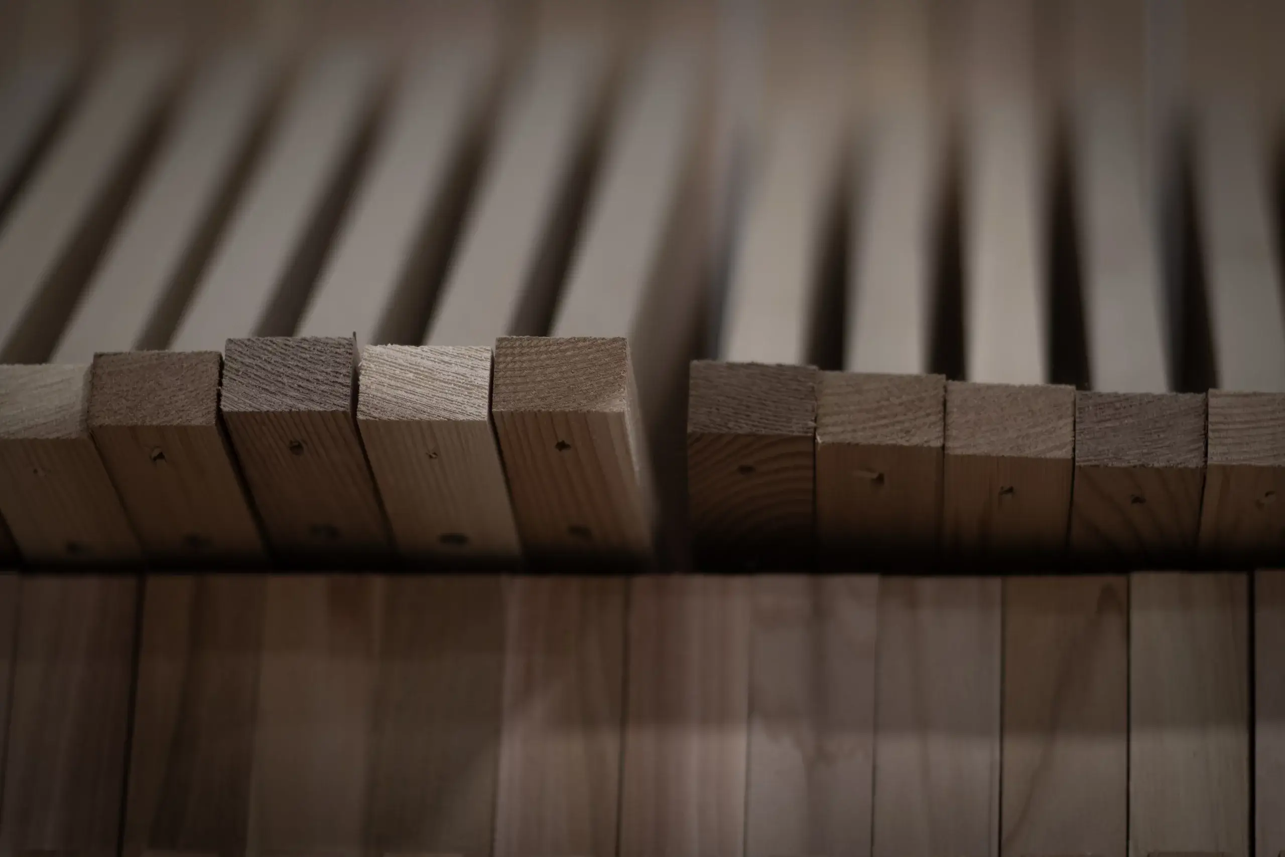
Above, Accoya and cedar in our workshop. We still use cedar for staging and shelving
The shift away from VOC’s (volatile organic compounds) in paint has been an industry objective for a long time now. An objective mirrored across construction, manufacturing and consumer goods industries including clothing and, in the headlines recently, non-stick coatings on cookware. Whilst the concerns around waterproof clothing and frying pans is to do with PFAS (per- and polyfluoroalkyl substances or forever chemicals) they, together with VOC’s, come under the overarching principle to reduce or minimise the use of harmful chemicals, both in the manufacturing processes and their ongoing presence in our homes, work spaces and the wider environment, making life cleaner and safer for us all. One ‘problem’ is that the reason the harmful chemicals were used in the first place is because they were good – that is to say they performed a needed function well. And they worked for years and years. And, until we get better with alternative ingredients, we do see a dip in the performance levels that people are used to. Anyone feel like the waterproof jacket they bought 20 years ago worked better and lasted longer than the one they bought more recently? Basically, it did. But the ingredient chemicals that made it so are now known to be harmful to the environment and people.
There is, of course, a separate argument around whether, using the clothing example, reducing the lifespan of a product such that the consumer needs to replace it far more regularly has its own undesirable negative impact on the environment. When evaluating sustainability from a whole lifecycle point of view, the buy better / buy once mantra wins out. Buying fewer things, looking after them, mending them, recycling them, handing them down, all leave a much lighter impression on the world than chucking something in the bin and buying a new one.
Two important points come from this – one, care and maintenance promote longevity and is one of the most important contributions each of us can make to us all living in a sustainable world, and two, choose the colour of your greenhouse very carefully – you don’t want to go off it in a few years’ time!
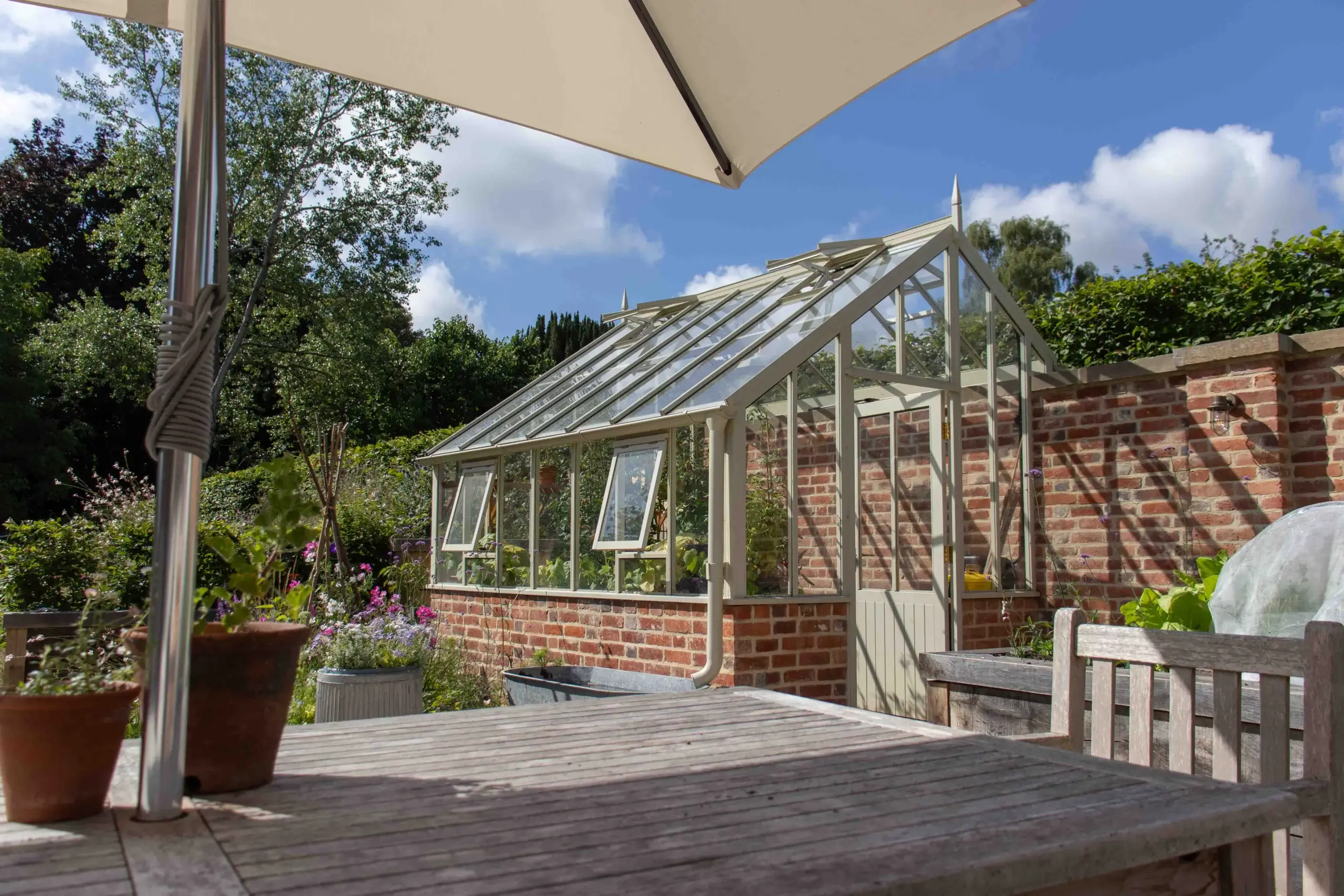
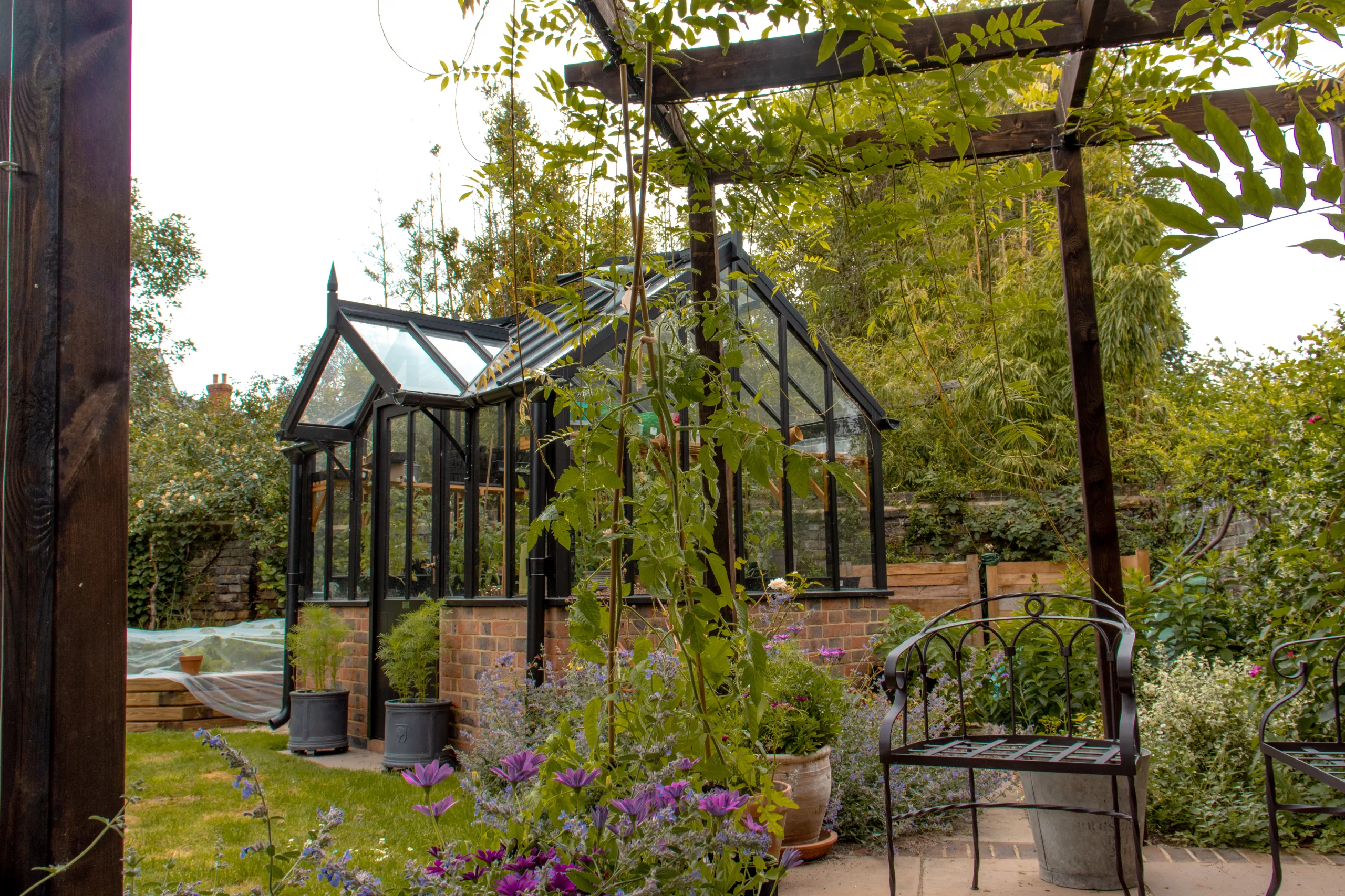
Above left, Edwardian three-quarter span in Oatmeal. Above right, the Croft in Black. Colour can help ensure the greenhouse doesn’t dominate the space or it can be used to tie the greenhouse in to other adjacent architectural features
Maintenance
Our recommendation is simple, easy and cheap. And is based on extensive real-time field testing carried out by Teknos with Accsys in the Netherlands.
Keep it clean.
Twice a year, more is fine, less is not, clean the greenhouse top to bottom, inside and out with some mild soapy water and a bit of elbow grease. Be thorough. Clean everywhere – the glass, the roof, the sides, the gutters. Use a stiff brush to get into all the corners where spiders build their webs. Clear out all the debris, the dead insects, the twigs and leaves and use something like a plant label or other pokey tool to get into the narrow gap at the bottom of each pane of glass, between the glass and the sill of the greenhouse, to clear out the green mossy build up that will be developing there. These gaps are there purposefully, to allow the condensation that occurs inside the greenhouse to escape, so don’t be tempted to run some sealant along them to keep the dirt out. The greenhouse sill is designed to shed this water as long as it can flow through, preventing it from accumulating on the framework where it can eventually do damage. Find the right tool to get in there and enjoy the satisfaction of releasing all that gunk.
As you scrub, you will naturally be paying close attention to the greenhouse as you go. You’ll spot any damage or compromise to the paintwork and can immediately attend to it (with a small brush and the touch up paint we will leave you with). Minor potential problems are nipped in the bud rather than turning into a full recoat job. Do this and it will be many years before a full recoat is needed. The ongoing, real time testing that Teknos are doing has reaffirmed their position on this and we pass on their 10-12 year warranty on our factory finish with complete confidence and the expectation that most people’s experience will well exceed this.
You can read more about Accoya’s unrivalled performance and sustainability efforts here and you can get the full lowdown on the low impact ingredients that make Teknos paints so safe and reliable here.
Our palette of 15 standard colours can be viewed here. Please get in touch to request larger, accurate paint samples or to discuss a custom colour. Generally, where custom colours are concerned, if it’s a RAL it should be straight forward and we charge a minimal additional fee. We can also usually match to Farrow & Ball, Little Greene, Dulux etc but the cost may be off putting, especially if the greenhouse is small. If you want us to match to your spaniel or the dress you wore to get married in it will be best if you give us a ring.
Comments
This article doesn't have any comments yet.